
Eugene van der Merwe explains how the warm and colourful tones of lith prints are created in the traditional darkroom.
Article and photos by Cape Town School of Photography lecturer Eugene van der Merwe.
It seems like a law of nature that the first time I take a bunch of new students into the darkroom, and show them how to make a black and white handprint, at least one person will remark “It’s like magic!” as the print comes up in the developer. Well, normal black and white printing is like Gummi-Berry-Juice magic compared to the Voldemort-and-Dumbledore-having-a-tiff magic of lith printing.


The process is fairly simple: stick a normal black and white negative in the enlarger, overexpose the paper by a couple of stops, and then wait long enough to feel yourself growing older for the print to come up in diluted, dodgy brown looking, slightly smelly lith developer. The simplicity of the process is deceptive though, because the results are infinitely variable and very hard to master. After a good few years of making lith prints you are still more likely to hear me say “What the %&$# is going on!” than “Ooh, that’s cool.” while bending over the developer tray.


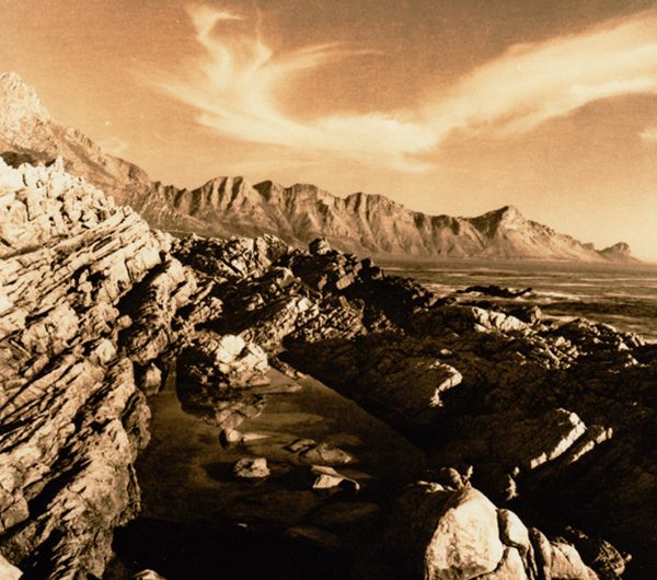
In a nutshell, these are the results you can expect: Smooth, soft, warm and very colourful light tones, and cold, hard, contrasty, gritty looking shadows. Longer exposures under the enlarger mean shorter developer times, lower contrast and often slightly less colour. Shorter exposures give higher contrast and typically a more noticeable colour difference between light tones and shadows. Have a look at the comparison images below, these are made on the same type of paper, using the same negative and developer as the main images, the only changes are different exposure times, and fresher developer.


As far as the developer goes, any change can make a dramatic difference: Dilution, temperature, age, how many prints have been through it, even the size of the tray seems to make a difference. Also not all papers work in lith, especially not most cheap RC papers. Many old papers do though, so keep an eye out for names like Agfa Brovira, I made some really cool prints on 40 year-old sheets of this one a while back!
So, tricky it may be, but the results are well worth it. And no amount of short attention span encouraging, instant gratification frames-per-second, high-dynamic-range, composite-image digital happy snapping can compare with this slow soulful process, and the ultimate satisfaction of getting that one perfect print…


