

A photographic font with a South African flavour: “Pap en Wors” by Potchefstroom-based designer Danielle Groenewald.
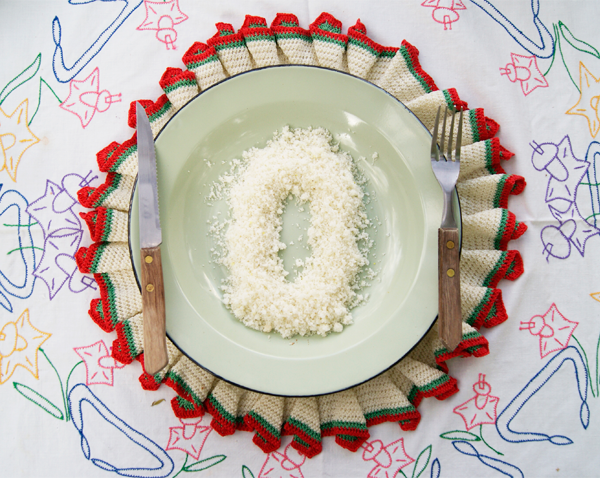
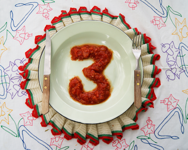
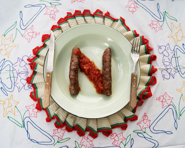
Potchefstroom-based designer Danielle Groenewald has created an entire font centred around the iconic South African dish, “Pap en Wors“.
Using boerewors, krummel pap, and tomato and onion relish, she arranged the ingredients to create letterforms, reproducing the alphabet as a photographic series with a uniquely South African flavour.
The final font was presented as a poster:

View more of the typography on Danielle’s Behance portfolio.


Photographs shared under the Creative Commons Attribution Non-Commercial licence.


