A great guide to the art of interior photography by Russell Smith, with some great tips on lighting and composition.
By Russell Smith.
I have always had a fascination for spaces and people’s places!
When I visit someone’s home for the first time I always feel the desire to walk around their whole house. Just like the shoes a person wears, it gives one a good insight into their personalities (well, almost)!
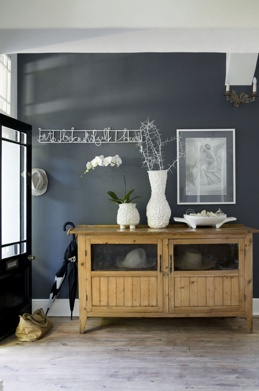
I started my career shooting decor and interior photography and still enjoy it even though I seem to shoot it less often now. One of the rewarding aspects of shooting spaces, is that it usually belongs to, or is the product of someone’s work, be it the interior decorator, architect or the homeowner themselves who are very proud of it and are delighted that you are taking the time to shoot it.
There is a definite art in capturing and representing the feel of the space to someone who has never been there before. Sometimes you have to capture this with a single image that will accompany a small article in the entertaining or travel section of a magazine or you will have 6 to 8 pages in a main decor editorial piece.
Often I have the luxury of being accompanied by a decor stylist who, besides bringing flowers and props like books, cushions, throws etc. will help to order a shot and often remove what is not needed or clutters the frame. This is huge win when you have to shoot the bed and the all too often discussion arises: do we leave it pristine or give it the just-slept in look? Often the idea when shooting a home is to represent the way the homeowners live, and therefore not to bring too much from the outside that will misrepresent their taste. If it is a decor story, say on bathrooms or reception areas or interesting lights for example, then the stylist will source the different items to tell the story. Here the space is almost the back drop to your story, rather than the story itself.
The client or magazine that you are shooting for will also dictate the style of shooting. An architectural story will be more about the lines and space while a paint story will be more about the walls and colour. Likewise, House and Leisure have for a while now introduced people and lifestyle into their interiors – so kids or dogs playing, or an adult opening the fridge will be integral to the shoot. On the other hand, Elle Deco may just want more cutting edge design spaces without people. This too will dictate what happens to the bed I mentioned earlier.
When I used to shoot for Real Simple magazine, our guidelines had prescribed angles that we could shoot at. It was designed to be more graphic with straighter lines. So we had the option of shooting straight on, classic three quarter or from above.
Angles and light:
Daylight is again my preference when shooting interiors. It simply looks more natural and gives a better indication of how the light passes through the space. This does present some problems however. The light differential is often more than 4 stops different from outside to indoors. This means that when the property agent asks you to shoot the Clifton beach cottage and make sure to get the sea and bathers through the windows, easier said then done! Our eyes are amazingly designed to read a much larger dynamic range than film or camera sensors. What would read as a correct exposure inside typically reads greatly over exposed outside. When shooting outside in, what looks right outdoors with the same exposure reads dark indoors. The obvious solution when shooting interiors would be to expose more for outside and lift the indoor light artificially with flash thus balancing the light more. However, you will soon realise that this alters and detracts from the interior light and all mood is lost. My only solution, dare I say it, for this is to shoot multiple exposures, a correct one for inside and a darker exposure for out the windows and comp them together in post. Or to tell the property agent to take the pic himself!
I must add here that if you are going to shoot a composite, then leave the outside brighter and a little more over exposed compared to the interior, otherwise it might look faked.
I like to keep mood in my interior images. Call me romantic but it elicits more emotion and wonderment than when lights are all on and shadows all filled in.
Unlike a controlled lighting set up, buildings have windows sometimes in the wrong places. We as photographers have to work around an existing structure with light sources sometimes coming from behind us which tends to drop off quickly giving dark far walls or the opposite where we have to shoot directly into a window and can get nasty flair. My solution to this (and sometimes it is unavoidable) is to walk through the space and work out how many shots you have to take and what direction the sun will move through out the course of your shoot and plan accordingly. If you want lots of bright sun pouring in then follow that through the house. if there is a room with out windows or is independent of the light outdoors then shoot it when your out side light is not in the correct position for anything else.
Also, if the house or space is dark and moody then reflect that mood in your images by creating enough light to expose the detail of the room but don’t crank up the exposure to make it look like a sunny loft!
I have a pet hate for lines that are not straight! My previous medium format film camera, a Mamiya RZ, on its tripod was a magnificent interiors camera with lenses that never distorted unless they were ultra wide. With digital SLRs the lenses and slightest movement will throw the horizontals and verticals out. The trick is to keep the back of the camera parallel to the back wall as much as possible. When you start shooting high and angling the camera down or shooting low and pointing it up the lines will distort more. I have a little spirit level that fits into my hot shoe to help me gauge my camera’s angles. It is a small thing which I find helps a ton.
I try not to use a wide angle lens for interiors for the same reason but sometimes this is unavoidable when you are in a tight spot and need to get a lot in to your frame. If you can move back and use a longer lens then generally do that. I try not to shoot wider then 50mm but often end up at 35mm and have to correct distortion in post again. I do miss medium format!
When shooting an interior, try and put yourself into the shoes of the viewer of the images. If you have enough pages and shots of the space and you want to capture the flow of the space then shoot connectors. What I mean by this is shoot a room with a piece of furniture or a door that appears in another shot from a different angle so that one understands how it all fits together. Also fill the frame with interest. If the building is quirky or different show that in the images. Remember people are voyeuristic and want to get a glimpse into how other people live and work.
Often a good detail shot can tell more about a person then a full room. It also makes for good layouts to have some pull back images together with close ups.
If you are introducing people into your shot you have to be careful with their movement unless that is what you want. Often I am shooting at 1/4 of a second on a tripod and while a still life study will all be crystal clear, the Jack Russell probably won’t be. If you can get the person (or dog) to sit very still or even introduce a little beauty dish balanced with daylight to up the shutter speed then good. Just be careful that when you introduce artificial flash that it looks natural and is more of a fill than a key light.
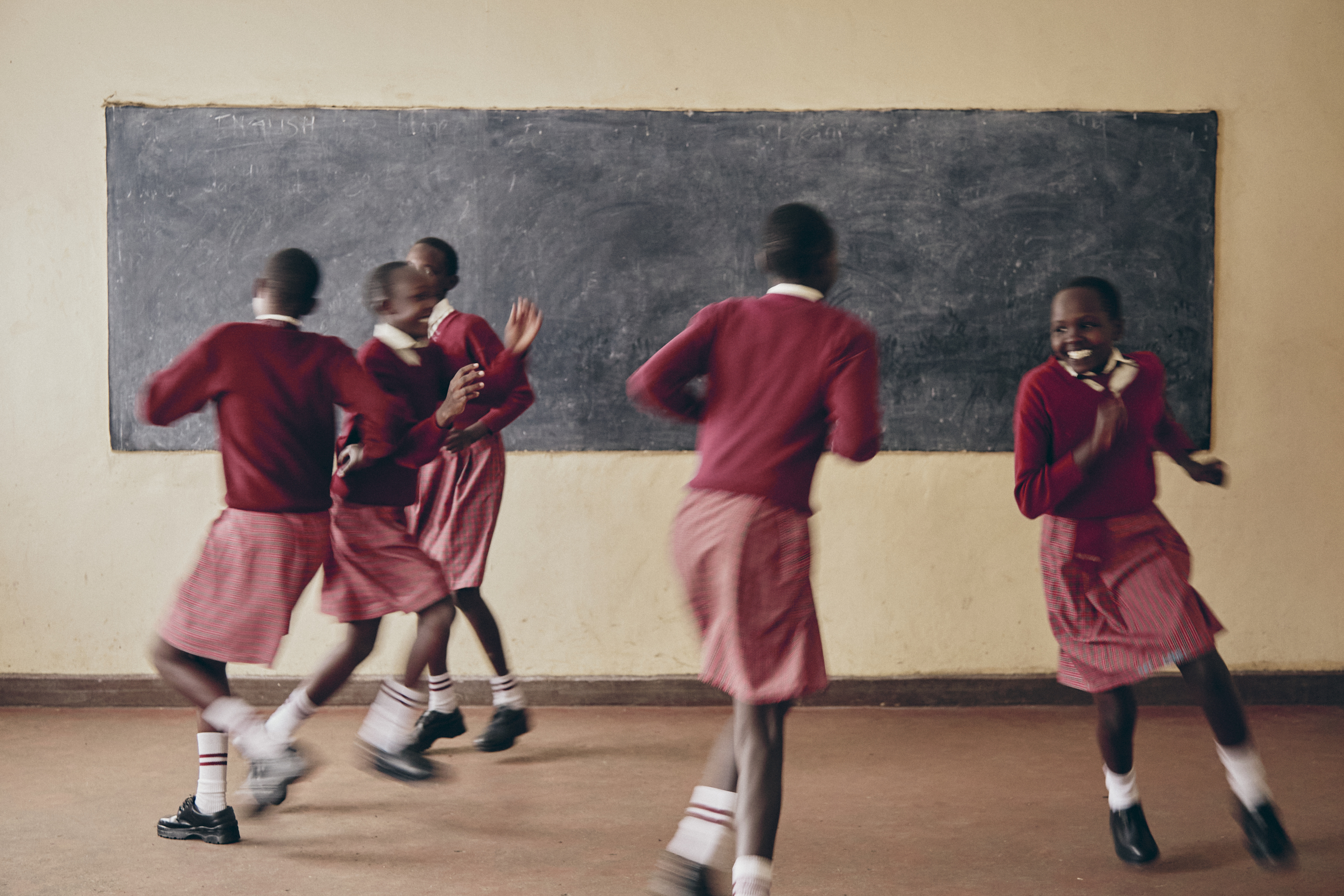
Often, interior or decor stories require a portrait of the home owner or family/kids. The trend has moved away from formal poses to them interacting with their environment. It is important to take control and direct this and not try and get something spontaneous. You need to recreate spontaneity!
Exterior shots are best left for good times of the day like early sunrise or near sunset. Again be aware of converging lines and being too close to the facade. You want to show the exterior lines and dimensions so get to a point where you can build context but not with too much distortion, generally speaking.
My last point on this post is that you will find that you will be asked to photograph a space that doesn’t appeal to you. It can’t happen that you like everything you shoot. There are too many different styles and people in this world with their own taste for you to be enamoured with it all. It is up to you as a professional to extract the beauty to the maximum and do justice to that the person who has designed it that way. Sometimes you will walk in and not be able to get a bad angle while other times you will have to dig deep.
Post originally appeared on Russell’s blog. Russell is a prominent food and portraiture photographer based in Cape Town, but also enjoys to document his travels.


