Some basic advice for pro photographers about corporate branding, logotypes, website design, portfolio selections and business cards.
If you earn your living through your photography, congrats!* You’ve become successful in a very difficult and competitive industry, and now you’re doing what you love while putting food on the table. Job? What job, right? But even if you’ve broken into the industry, there are still places to go and more clients to reach. Here are some tips to improve your marketing. They might not be applicable to everyone or every situation, but hopefully you’ll benefit from some of the advice.
*If you don’t, but you want to, then these tips are also for you.
Branding
Your name is your brand. This deserves repeating: Your name is your brand.
What is the point of branding? There are many textbooks written on the topic, but the bottom line is to create some form of association. Through successful branding, people will think of exactly the same thing every time they see or read or hear your name, and you can control what that “thing” is – like “best wedding photographer in the southern hemisphere.”
So why should your name be the brand? Well, at the end of the day, what differentiates you from every other photography business in your city? Yourself. You are the photographer. Your business is only the paperwork around that. Clients come and go. The genres you shoot are open to change. Your style evolves. But the only thing that stays the same is your name. You can add the suffix “Photography” if you’d like to let people know exactly what you do, but your name should always be in your branding.
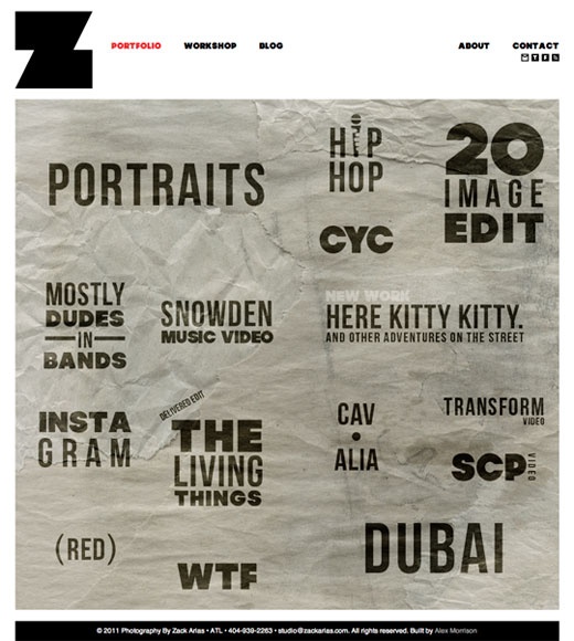
 Zack Arias’ website – www.zackarias.com – is a great example of branding and website design. It’s simple and professional, features a relevant logotype and galleries are front and center (hovering over “portraits” displays a portrait and clicking on it brings up an HTML-powered lightbox gallery with a handy link for downloading a PDF of the collection). Contact information is very detailed and his social media links are highly visible.
Logo
A logo’s purpose is to communicate your branding visually. Many photographers make use of photographic elements such as cameras and apertures, but your name can also be a logo if designed correctly with an appropriate typeface – in fact, in many cases your name written in simple type can appear more professional than a complicated design. I make use of a camera in my own logo/avatar, but it’s a camera I personally own and illustrated myself. Then again I’m not a professional photographer and my logo doesn’t need to differentiate me in the marketplace.
Website
Keep your website simple. The URL should be easy to remember and you don’t need to include photography in it. Ideally, it should just be www.yourname.com or .co.za, although you can also use your initials if you have a really long name. On your website itself, your contact details should be front and centre. You can implement a contact form if you want, but remember to also list your mobile number and email address. If your business is not branded with your name, don’t forget to include your name on your site as well (it happens!). Keep your galleries neat and emphasise ease of use instead of looking flashy. Speaking of Flash, try to avoid it. It isn’t a universal web standard, so some of your visitors might not be able to view Flash content, especially mobile users. Smartphone browsing is rising rapidly, and most phones can’t view Flash content due to its resource requirements. If you really want the effects that Flash allows you to have, then ask your developer to look at HTML5 first.
I started by saying you should keep your website simple – essentially, your website is there to show people your work and provide them with your contact details. You might feel that the design of your website should differentiate you from other photographers, but it’s more important that your photography does this for you. However, at the end of the day your site should reflect your style and personality, so the design is up to you. Just make sure that it is easy and trouble-free for a potential client to view your galleries. In the long run, it’s worth it to shop around and find a good web designer/developer.
Your about page is important, but should be kept short and to the point. List your main clients and achievements, as well as any awards or press coverage you might have received. Include your experience in the form of years in the industry or any relevant academic degrees.
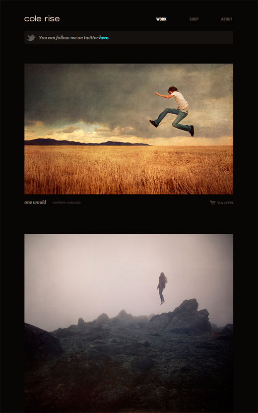
 Cole Rise’s website – www.colerise.com – is also a good example of a photographer’s site. The emphasis is on the photography, following a blog-like layout. It’s never a great idea to break the horizontal scroll – i.e. make people have to scroll from side-to-side. Therefore a layout like this allows you to show all your images in a way that’s easy to navigate.
Portfolio
Your portfolio should be concise, preferably limited to about 10 or 15 of your best photographs. Some people recommend that you spread out your best work through the entire portfolio, but I believe the work should be arranged from best to great. A client or art director looking through your portfolio might be busy, and won’t necessarily look at all 15 photographs, therefore it’s important to make sure the work that they actually see is your best.
Keep your portfolio up to date, and by that I don’t mean you should include your latest shoot – just make sure that at any given time it includes your 15 best photographs. The presentation of your portfolio is up to you, but you can’t go wrong with a simple leather binder or something similar. It’s also a good idea to replicate your portfolio digitally on your website in the form of a “best photos” or “favourites” gallery.
Lastly, don’t hesitate to remove a photograph if it’s bringing the rest of your portfolio down. It might have been a great shot when you took it, or it might have received a lot of praise from your peers, but if it doesn’t seem to fit in with the rest, chuck it out. 5 excellent photographs on their own are better than 5 excellent photographs and 5 mediocre ones.
Business Cards
Finally, business cards. These little pieces of paper are crucial to keep on your person and hand out at any appropriate opportunity. Much has been written about the merits of business cards, but the key points to remember is that they remind people about you in a world where we are bombarded with information from every outlet. It’s not necessary to spend a fortune on them, just make sure that the paper stock is decent and the design is legible. If you are on social media, include the relevant details so that people can find you and add you to their networks. If your branding has been successful, it’s not even necessary for a photographer to add photos to the “logo” side of the card.
If you liked this post, you will also enjoy Russell Smith’s related post entitled The Power of Branding.
Disclaimer: I’m not a professional photographer and I don’t claim to be one. However, I have 3 years of experience in the industry and a degree in applied design, which included marketing theory. Give us a shout in the comments if you agree or disagree with any of the advice – we would like to know what you think!


