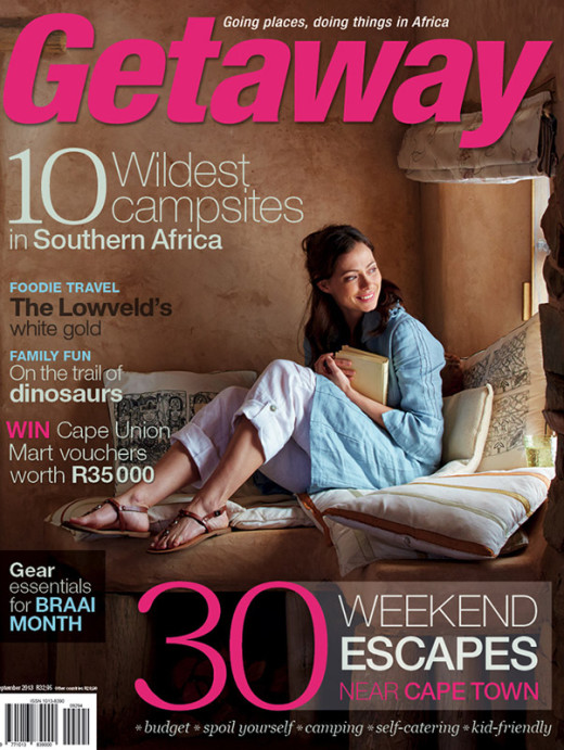
Russell Smith has been tasked with shooting Getaway’s new lifestyle covers – Read more about the behind-the-scenes of the shoots.
Article and photography by Russell Smith.
A few months back, Getaway Magazine, after 25 years of shooting landscapes or places on their covers, decided to change track and I was asked to shoot the covers of their changed strategy.
The brief was simple: the sense of place is more important then the place itself. It is about creating a mood, an authentic moment in time in a place that you would love to be or at least read about in the mag.
Our shoot is one set up specifically to be used for the cover where the image is not taken from an existing editorial assignment.
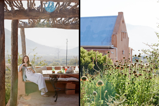
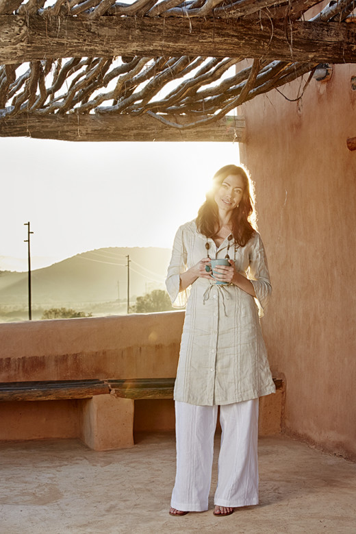
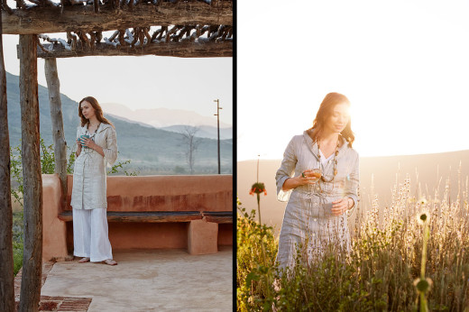
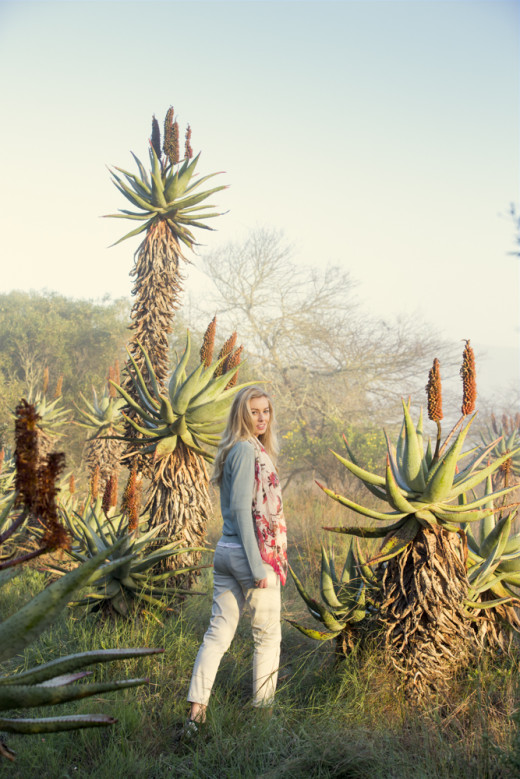
The locations are carefully planned to time in with a major editorial in the mag of that month, the season and feel of the content too. Our first shoot was up in Mcgregor for the first new-look issue (above) and while the final selection ended up being indoors, the mood, light, colour and texture of the walls gave the feeling of being away. The second cover shoot was in Bontebok National park which was for the bush feel.
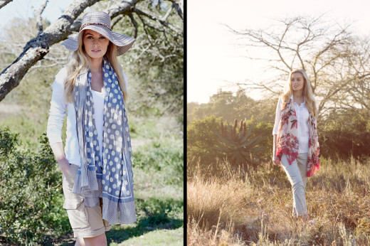
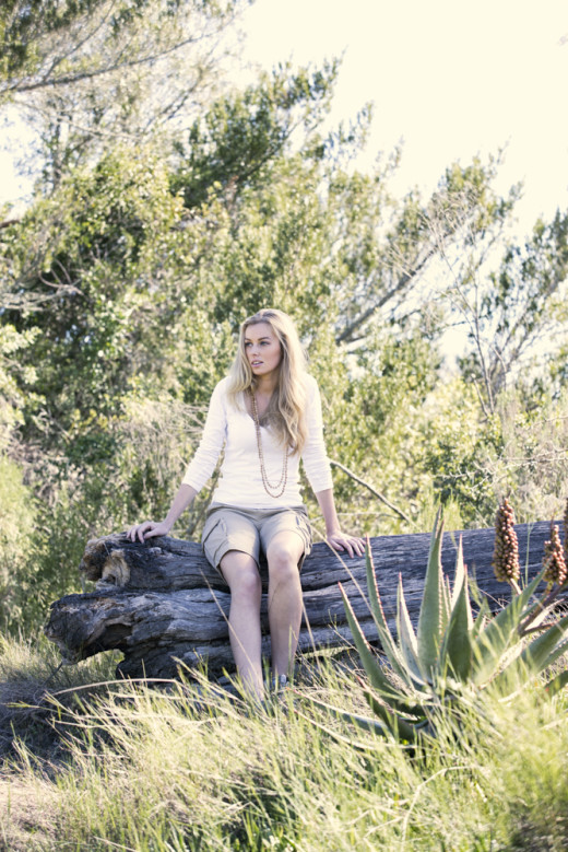
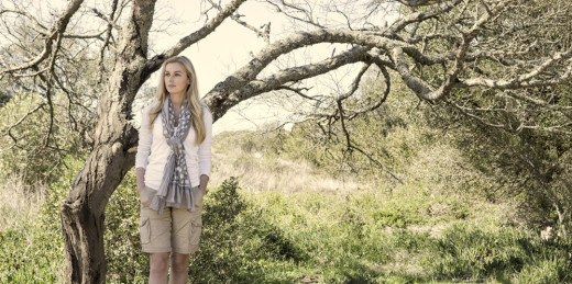
We cast a model that is authentic in that she could be in that place doing what she is doing. She is briefed to look natural in her environment with the key difference being that she is not selling clothes but rather a lifestyle, portraying herself in that moment in time. I have attached some outtakes here that didn’t make it to the cover. Some that are more posed in that they have a more fashion feel but I just loved the images even though they were off-brief.
The hair/make-up and wardrobe are all pretty natural and have to lend to the authenticity of the shoot. While there has to be an element of glam and style it can’t scream latest fashion trends either.
The masthead, cover lines and proportion of model to overall cover page all have to be considered. The image has to be memorable and almost described with one short phrase: ‘the women by the window’, ‘sitting on the palm tree’, etc.
The key element at the end of the day is creating mood. Often with the use of light but using the surroundings too. I just went up to Limpopo to shoot the next issues cover and for the two days we were there, the sun didn’t come out. In fact the high altitude created this pervasive mist over the mountains which was used instead to give whimsy to the image.
To keep wit the natural feel and to limit distortion, I used a long lens (Canon 70-200mm f/2.8). All natural light with a little bounce and softening with the exception of a little light fill in the image that was used as the cover inside the room (first image above). With out it the contrast was too great and the shadows needed to be lifted by a stop.
It is always fascinating to me which final image is chosen by the art director for the cover. It is often the unrehearsed, in-between images that happen spontaneously that win the day.
Here’s a few more of the outtakes:
Post originally appeared on Russell Smith’s blog. Russell is a prominent food and portraiture photographer based in Cape Town, but also enjoys to document his travels.


