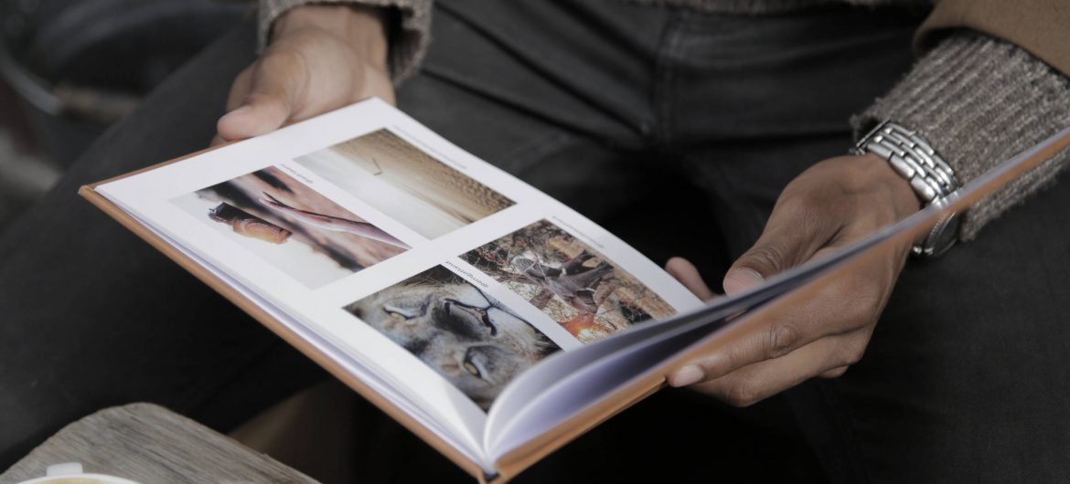
With our new ready-designed blank photobook templates it’s never been easier to get started on your next personalised photobook with Orms. Let’s take a look as Gemma shares a few design tips to get those creative juices flowing!
Picture this; you’ve just returned from the trip of a lifetime. You’ve made incredible memories and seen beautiful places, which you’ve managed to capture. But now what? Do you just leave those memories on your memory card or hard drive never to be looked at again? No ways.
With the Orms ‘Create & Print’ Software turning those photographs into tangible memories has never been easier! Gone are the days of having to know how to design a photobook yourself. With the templates on the ‘Create & Print’ software, there’s really no need to stress. It’s so quick and easy that you can test out a few options of what looks best before deciding on the final layout of each page. Simply drag the template onto the page and then insert the picture, it’s that easy!
We know it can be a bit overwhelming deciding which layout to use so we’ve put together some tips to help you make the most out of the software and create the best book for your memories.
TIPS:
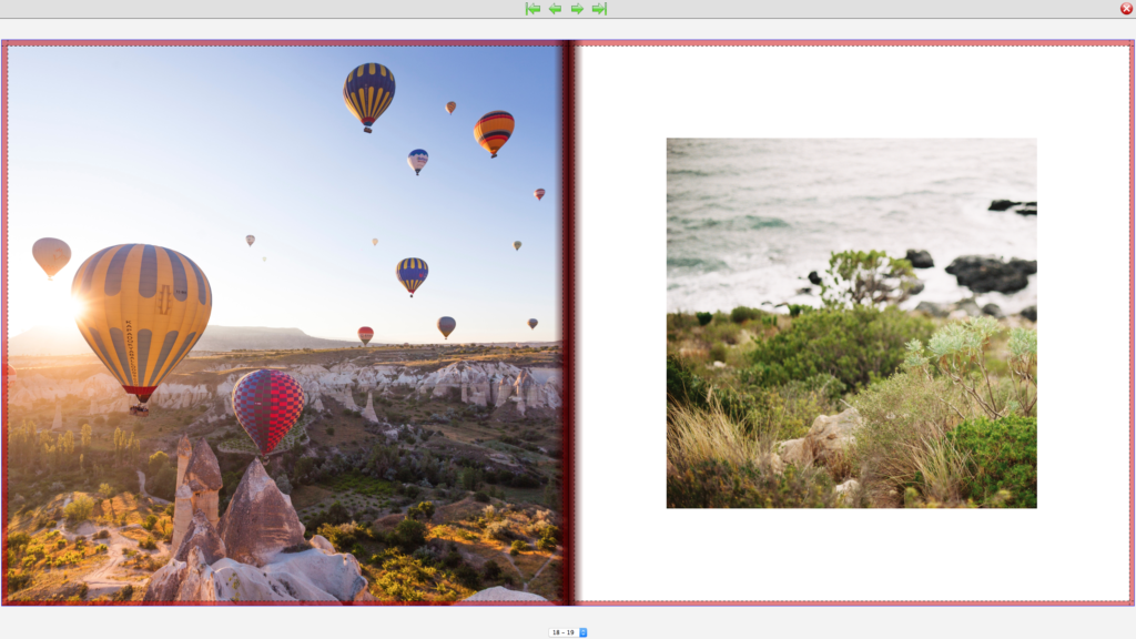
Tip 1: Use image formats that suit the page and the picture. If you’ve selected a square format book and are using a single image, a square crop is often the best option. This gives you a white frame around your photograph which you can adjust by changing the size of the template.
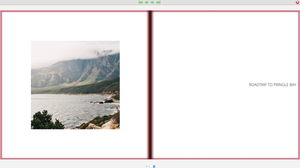
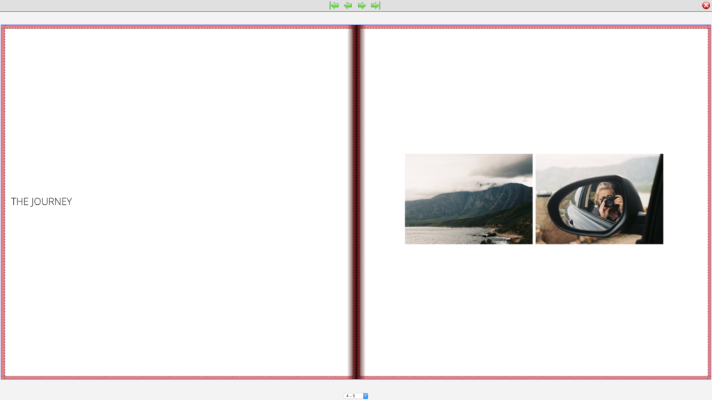
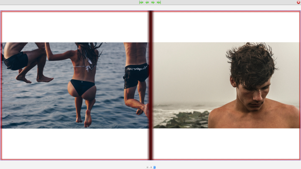
Tip 2: Using two images on a single page can work really well. We suggest using images that compliment each other. Using images with similar colour schemes is a good idea. However, sometimes juxtapositioning opposite/complimentary colours work just as well.
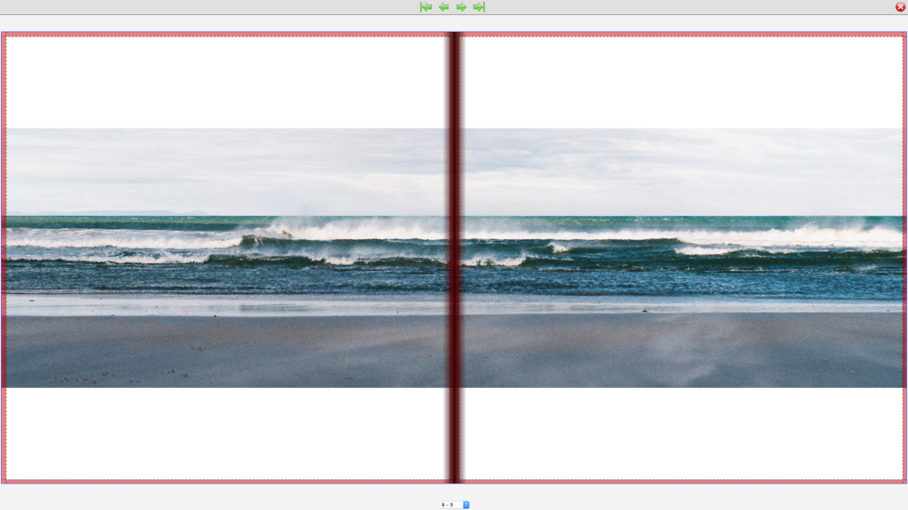
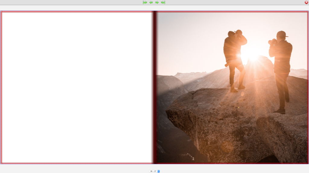
Tip 3: Sometimes its best to let the image speak for itself and not crowd it with many other images or texts on the page. We find this is ideal for landscapes. But be careful of losing too much of the image in the bleed here. We don’t recommend using this template for portraits unless you are creating an HD book which can lay flat.
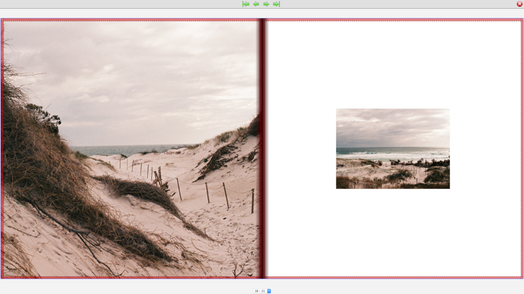
Tip 4: It’s nice to play around with the sizes of images on a double page spread. We love placing full page images next to smaller ones. The key here is to use images that work together such as images of the same subject but from different perspectives.
Tip 5: For a sequence of images, we suggest an Instagram feel. Our four square template works perfectly for a selection of images that work together.
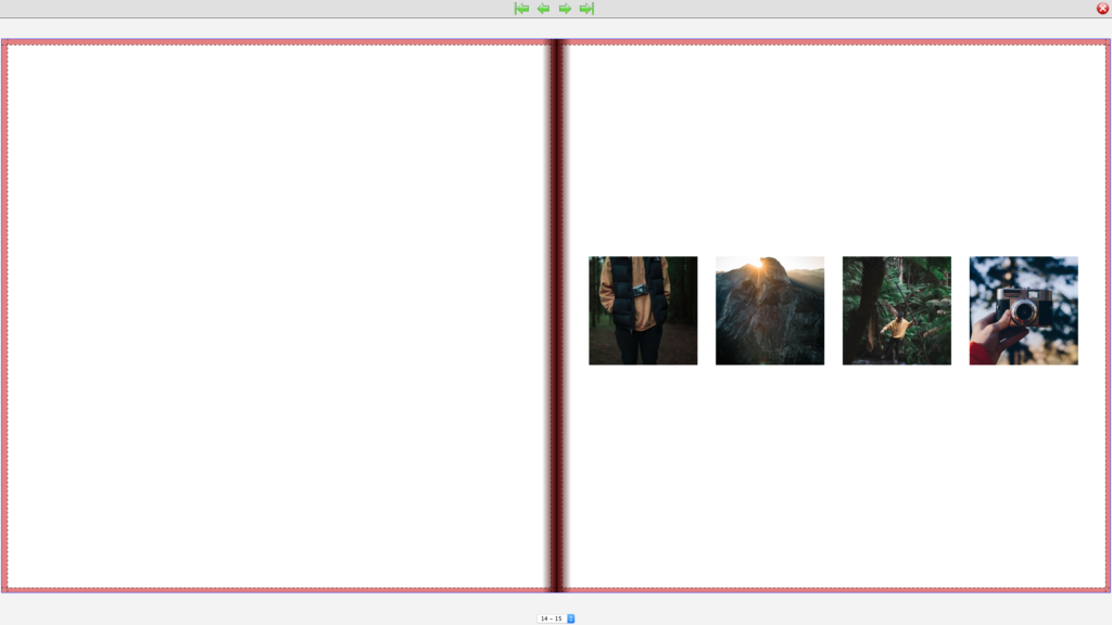
Tip 6: We suggest choosing a few page layouts and rotating them so that the book is cohesive and not too busy.
Lastly, all you need to do is send in your order and BOOM – new coffee table book and memories to last a lifetime!

