A look at the new darker themed user interface for Adobe Photoshop CS6, and a few of the early feature additions.
Apple Insider have gotten their hands on an early beta preview of Adobe Photoshop CS6. While the software is still being prepped for a May 2012 launch, some of the new features have already been implemented in the beta version.
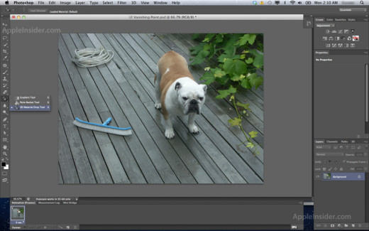
The first thing you’ll notice is the new Lightroom-like dark theme and the updated tool icons. While the dark theme might be welcomed by some, others can still revert back to the lighter theme (at least for now). Many commenters on Apple Insider and PetaPixel have stated that the new theme makes the software look like Photoshop Elements, the inexpensive, feature-reduced version of the software. While it may share the same darker look, the user interface is still essentially unchanged from previous versions of Photoshop – all the professional tools and elements you have become used to are still in the same locations.
Click on the image for a larger preview.
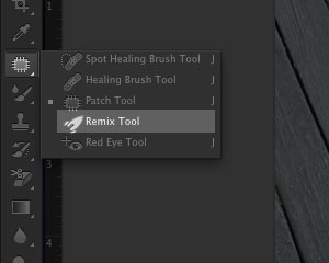
Other changes include the addition of new features and options. Adobe have extended the 3D tools that were added in CS4, and added some more options for those working with vector graphics. For the more traditional users of Photoshop, a “Perspective Crop” tool has been added, as well as a “Remix Tool” in the retouching pallet. New file handling options have also been added, including auto-recovery/backup settings and minor interface additions, such as showing transformation values.
 That rocket icon for the Remix Tool is very intriguing…
All-in-all, not a lot of new features at the moment, but we’re sure that Adobe will be announcing the full feature set closer to the launch. It seems like the CSI-like de-blurring tool recently announced at an Adobe event won’t be included in CS6 – we’ll just have to wait and see what happens with that technology.
In the meantime, take a look at what Photoshop would look like if the interface was made of “real life” elements – must see!
Via PetaPixel & Apple Insider. Visit the links for more coverage and screenshots.


WOW!! that looks so cool…look and feel of Lightroom. Awesome stuff!!