Both the size and composition of a video’s frame impact the effectiveness and power of the image contained therein. While in days gone by viewers only watched moving pictures in a cinema or on a 4:3 television screen, today there are more than 2.1 billion individuals worldwide using smartphones to watch video content on online streaming platforms like Netflix and YouTube who are once again revolutionising the way people view video. This blog post is a case study on aspect ratios, diving into both their rich history and present-day situation. It examines how manipulating how much of your image is visible onscreen can impact your storytelling potential and viewer experience of your films.
Ever since Plato’s Myth of the Cave we are used to seeing images in a specific space. In Plato’s Myth, prisoners are kept in a cave facing an interior wall, while behind them, at the entrance to the cave, there is a lighted fire with some people with statues and flags passing in front of the fire. At the same time, their shadows are projected onto the interior wall of the cave by fire’s light. The prisoners are looking at the moving shadows in that specific area of the wall. They are watching images as a simulation, a “simulacra” of reality, not reality itself. The myth of Plato is a metaphor for the Cinema.
Vittorio Storaro, 2007
Aspect Ratios
A Brief History of Aspect Ratios in Cinema and Television
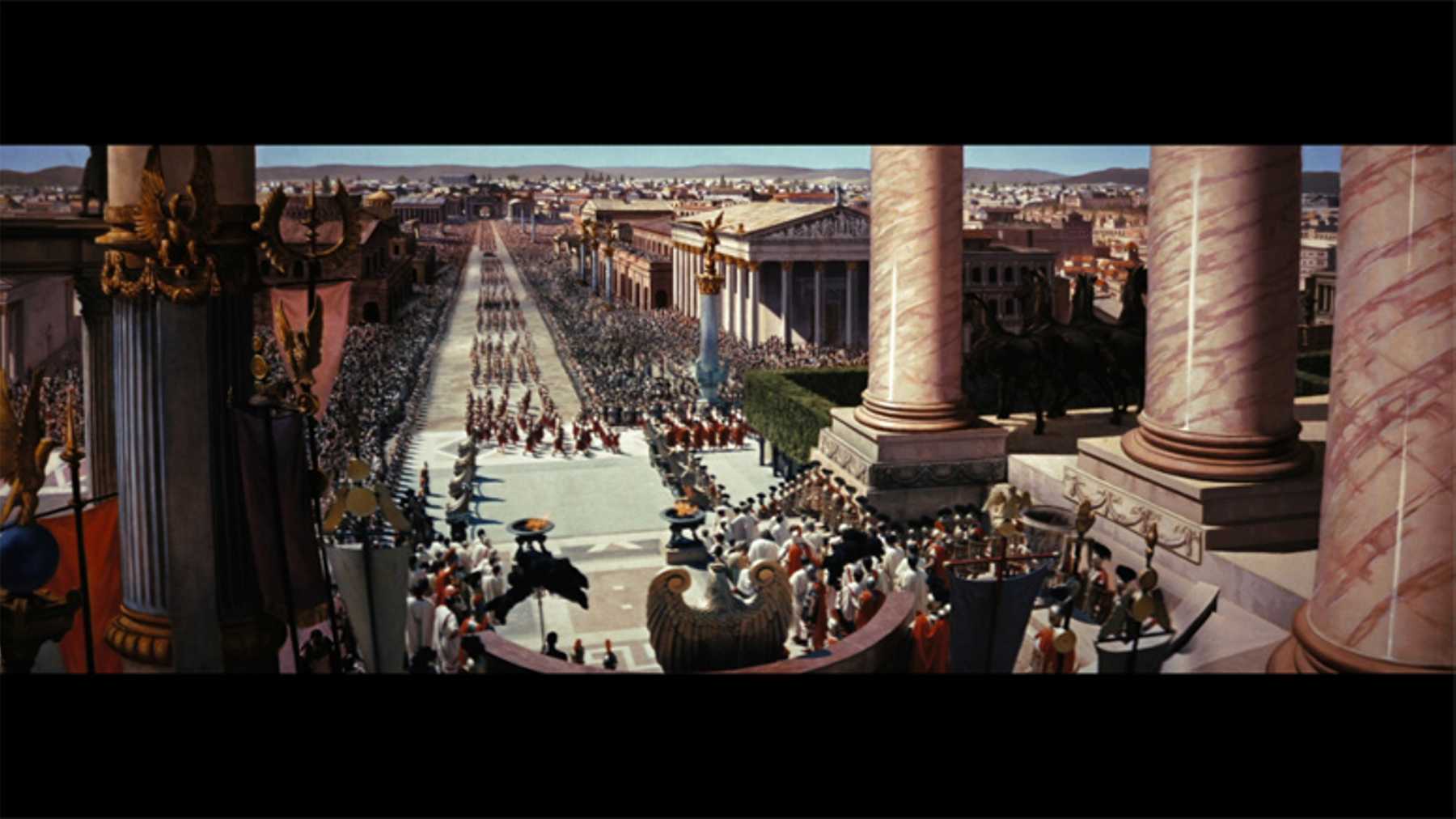
Aspect ratio can be simply defined as the width to height of an image, expressed as either a ratio (16:9) or a decimal (1.78); in some cases, the decimals are also written as ratios (e.g. 2.35:1). The original silent motion pictures were produced on 35mm film which contained images that were 0.95 inches wide by 0.735 inches high, thus an aspect ratio of 4:3. This was the standard format in the United States from 1909 until 1932 when the inclusion of synchronised sound in “talkies” caused the aspect ratio to adapt from 1.33 to 1.37 to accommodate the audio waveforms printed onto the film strip alongside the images. This became known as the Academy Ratio after the Academy of Motion Picture Arts and Sciences deemed the alteration to the original 1.33 ratio appropriate in 1932. In the 1950s with the television’s growth in popularity and declining ticket sales at the box office, the widescreen aspect ratio was born to offer a thrilling new experience to moviegoers to entice them back to the cinema. The ’50s saw experimentation with a plethora of new aspect ratios, from Fred Waller’s 2.59 Cinerama (as seen in 1962’s How the West Was Won), the 1.66 ratio of 1953’s Shane, and the outrageous, larger than life grandeur of Ben-Hur’s (1959) 2.76 aspect ratio.
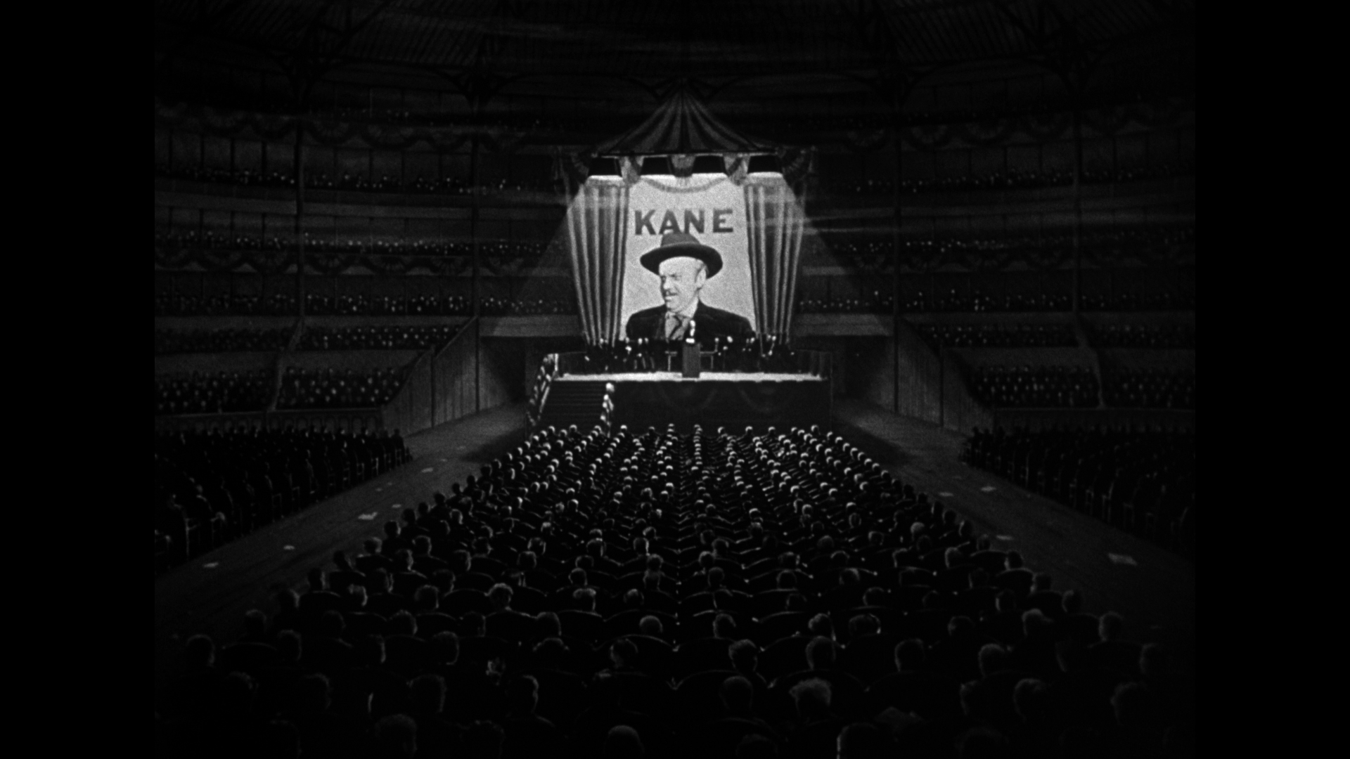
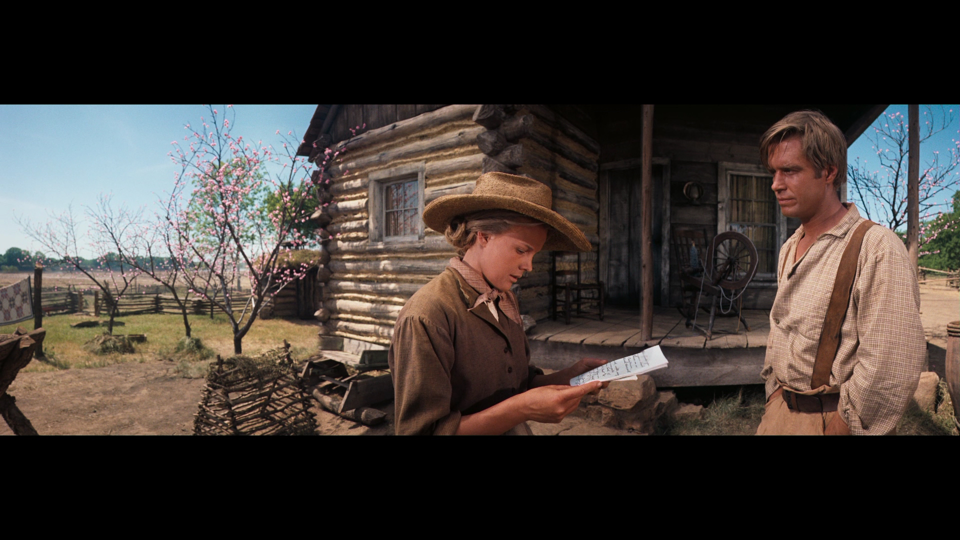
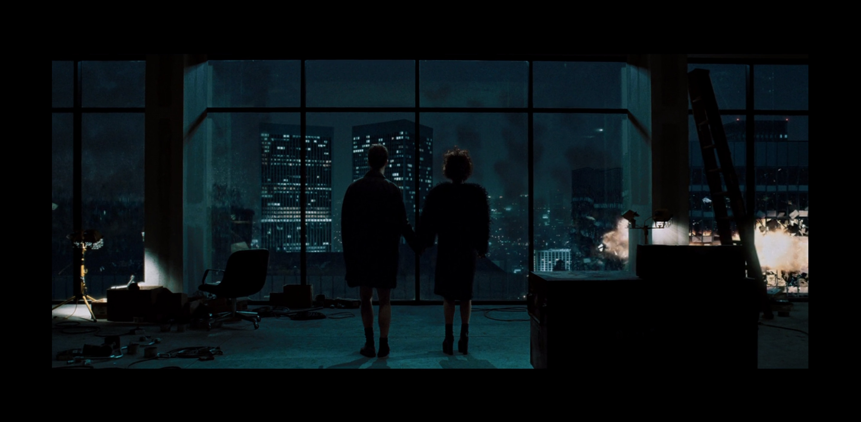
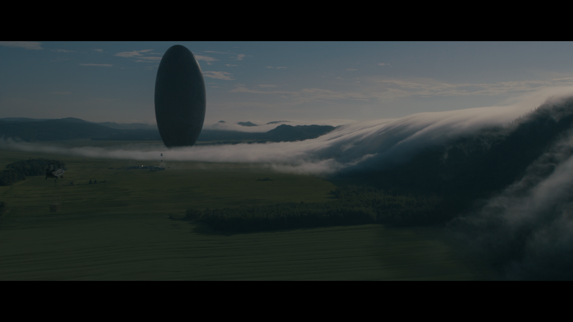
From this tumultuous era in cinema, two aspect ratios emerged to remain mainstream even to the present day. The first was the 2.35 aspect ratio, used for the first time and met with wild popularity in 1953’s The Robe, and seen in more recent years in everything from David Fincher’s Fight Club (1999) to Denis Villeneuve’s Arrival (2016). Today 2.35 is used virtually interchangeably with 2.39 (known colloquially as “Scope”) as the difference between the two is barely noticeable. The other aspect ratio to survive the 50s was the 1.85 aspect ratio, pioneered by Paramount and their VistaVision technique in their quest for producing a less grainy image. This secondary aspect ratio will be eternally associated with the work of master directors Alfred Hitchcock and Steven Spielberg, who respectively shot most of their work including legendary films such Vertigo (1958) and Schindler’s List (1993) in the 1.85 format.
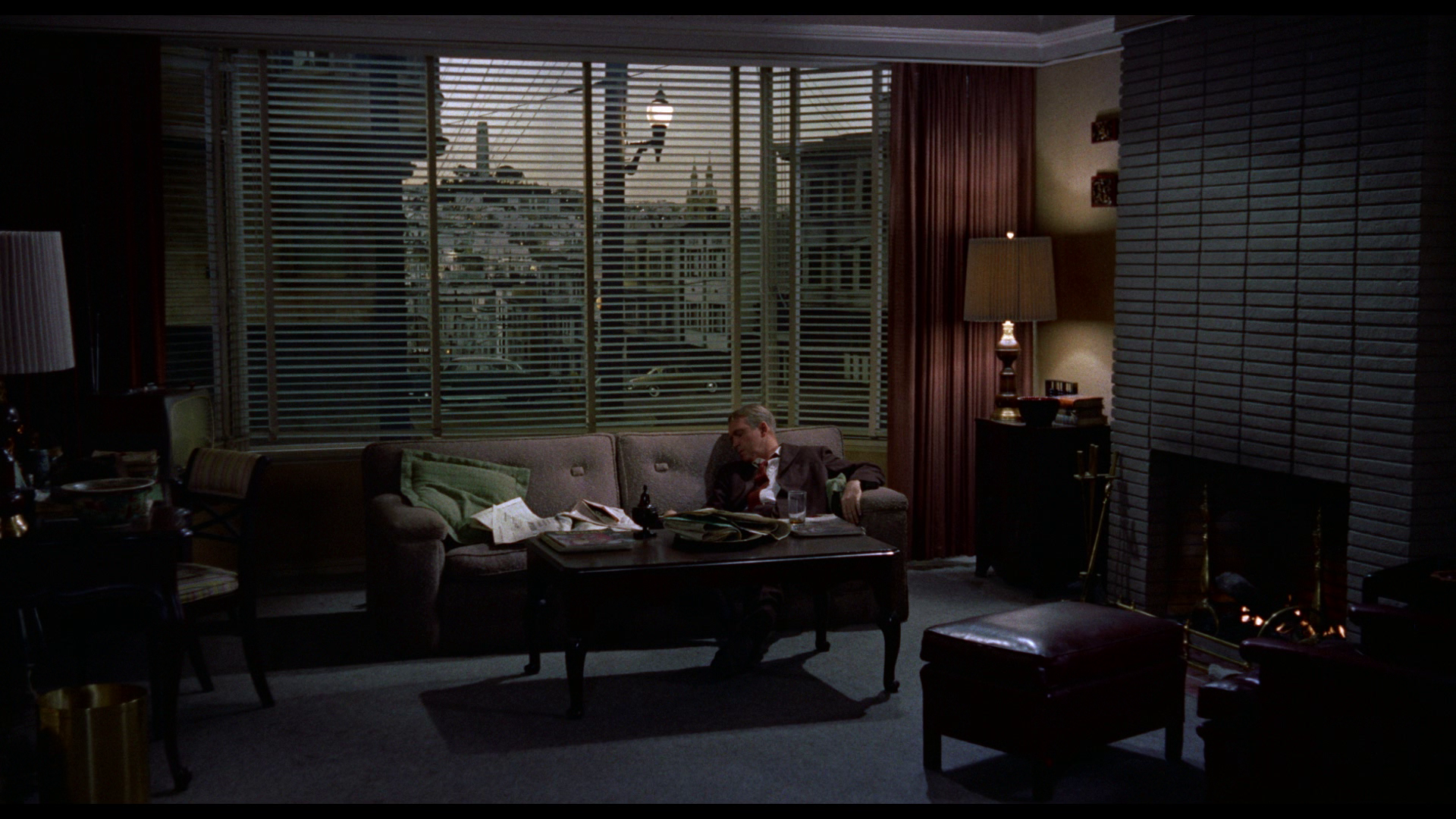
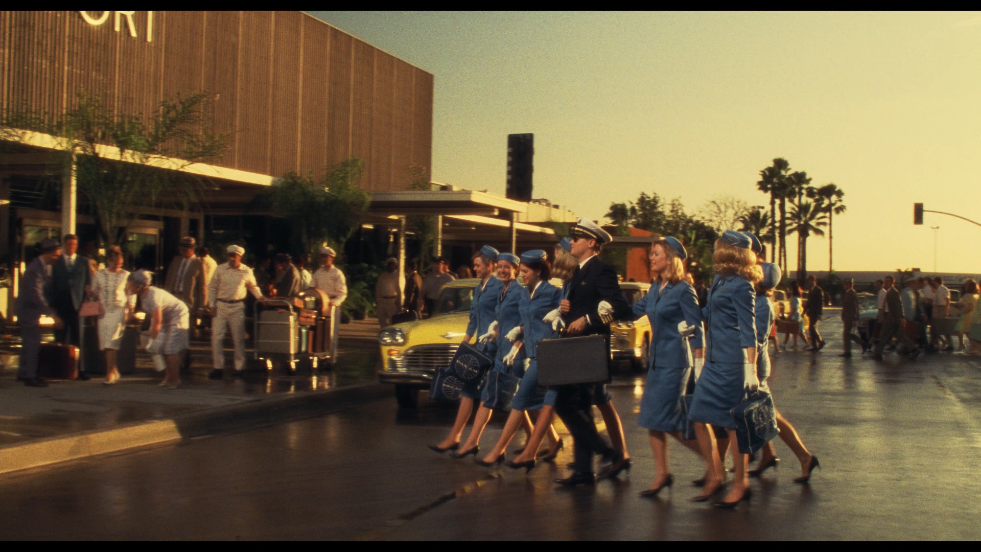
As for television, the standard aspect ratio of 16:9 or 1.78 arose in the late 1980s as an even geometric compromise between the most “extreme” of the common cinema aspect ratios: 1.33 and 2.35. This resulted in both established cinematic formats being equally pillar- or letter-boxed respectively to prevent the “butchering” (i.e. outright “pan-and-scan” distortion or cropping) of the image when being shown on a standard 4:3 TV or later on a widescreen 16:9 television screen. The vast majority of video productions for television today are shot in the 1.78 format to completely fill the screens on which the shows will eventually be aired. 16:9 is also the standard aspect ratio for viewing uploads to YouTube on a desktop computer. A diagram of the most common aspect ratios today can be viewed above.


Vittorio Storaro, Univisium and Netflix
In 1998 with the growing popularity of DVD and widescreen television sets and recognising the future possibilities of digital cameras, celebrated cinematographer Vittorio Storaro (The Conformist, Last Tango in Paris, Apocalypse Now and The Last Emperor) started advocating for a universally standard aspect ratio that would bridge the gap between the widescreen experience of cinema and the “small screen” one of television. Writing on his blog in 2007, Storaro makes the following crucial points about the aspect ratio situation in the 1990s, which is still true in the present day:
Recently, any movie—no matter how big or small, successful or not—will, after a very short life on the big screen, have a much longer life on an electronic screen.
[…] Having these two different media, with essentially two different aspect ratios, each of us (Directors, Production Designers, Cinematographers, Camera Operators, etc.) shares the nightmare of compromising the composition of the image.
[…] Since the Cinema is a language of images, by changing the original composition of the cinematographic picture we are altering the linguistic expression, the style and indeed the film itself.
Vittorio Storaro, 2007
This proposed aspect ratio that would unify any future theatrical and television films was Storaro’s own invention. “Univisium”, a macaronic Latin phrase for “unity of images”, is an aspect ratio of 2:1 (or 18:9), falling somewhere between the two most frequently used cinematic aspect ratios of 2.39 and 1.85. Storaro believed that a universal switch to this aspect ratio would respect “all co-authors who participate in the creation of Images and also all audiences with their own right to see a picture as it was conceived” (Vittorio Storaro, 2007). Unfortunately, neither cinema nor television liked Storaro’s idea, and with the exception of projects DPed by Storaro such as Cafe Society (2016), the 2:1 aspect ratio was scarcely utilised.
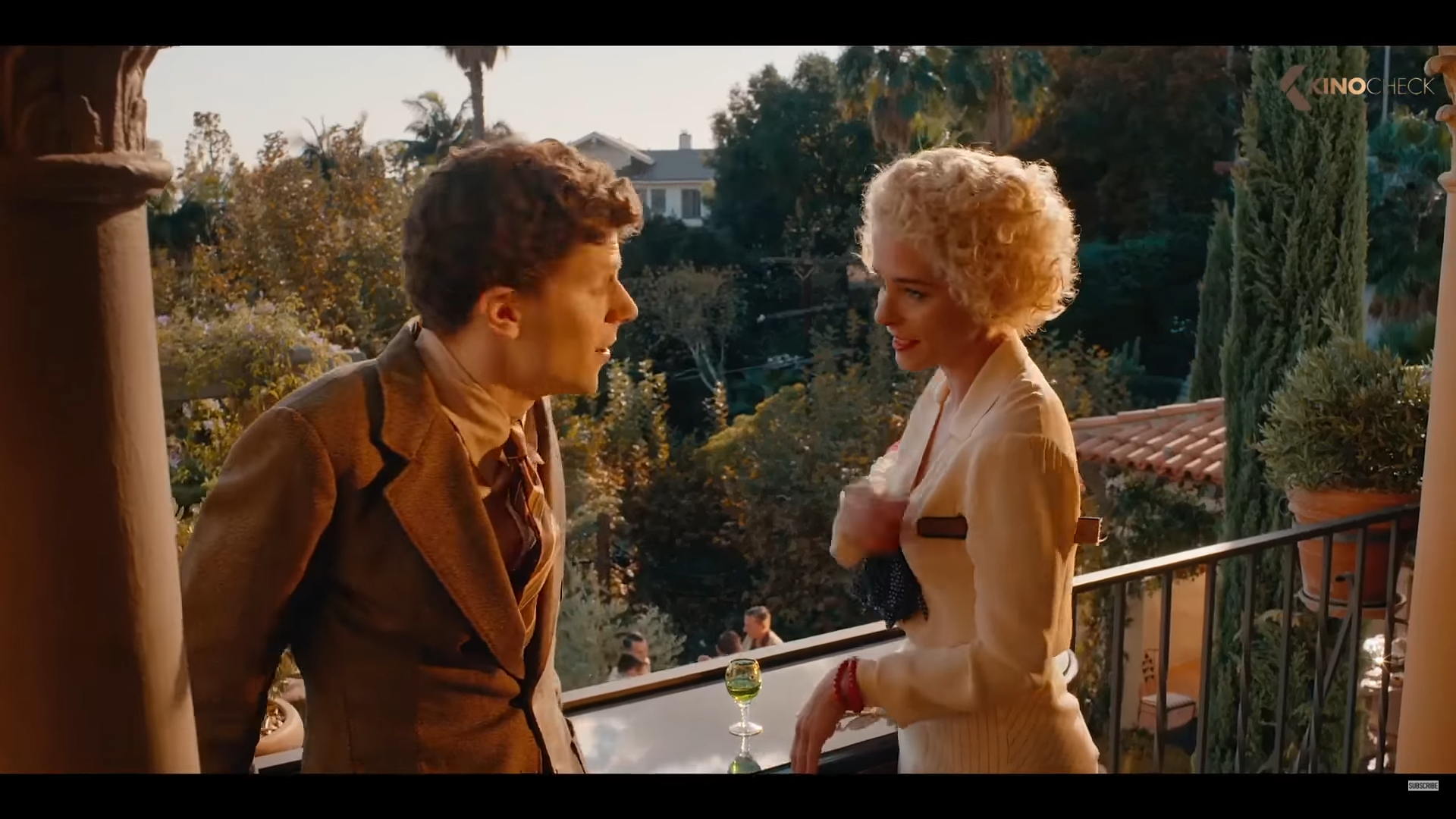
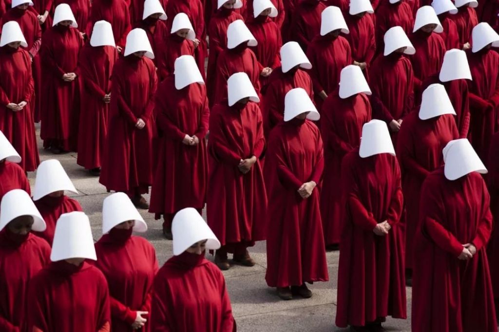
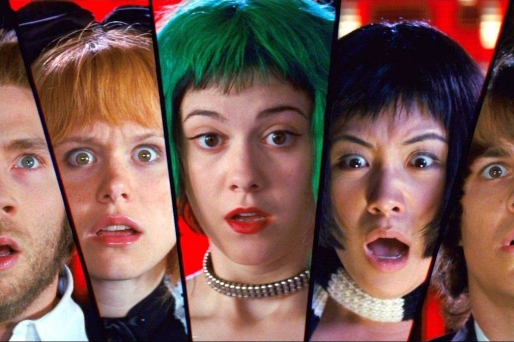
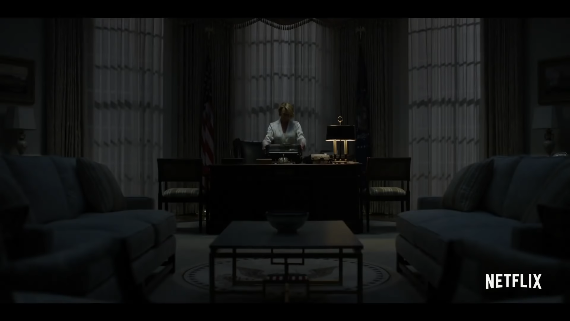
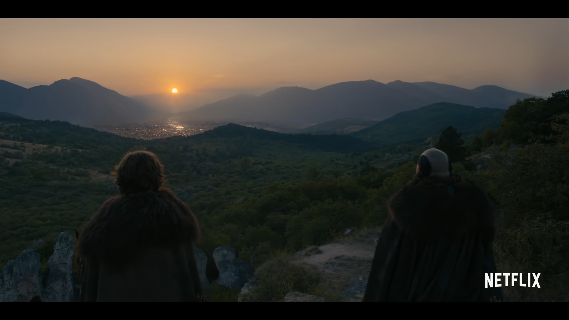
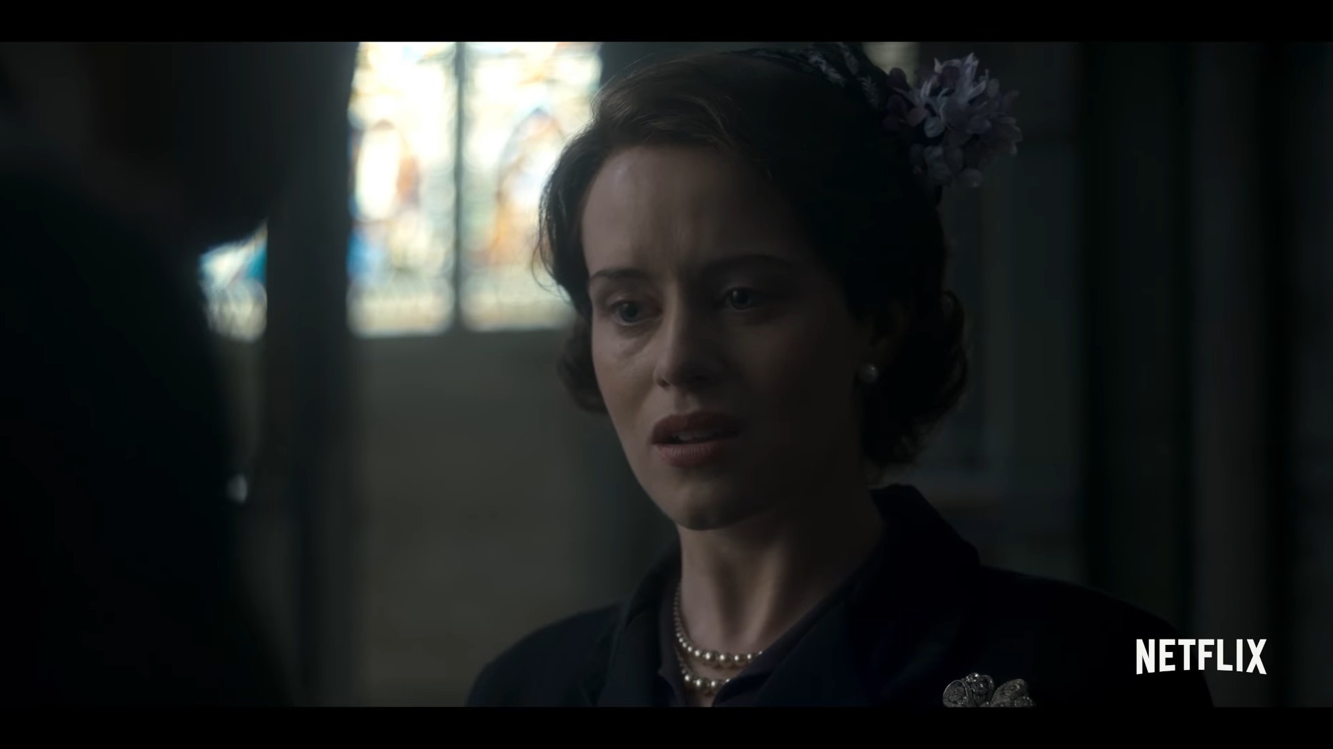
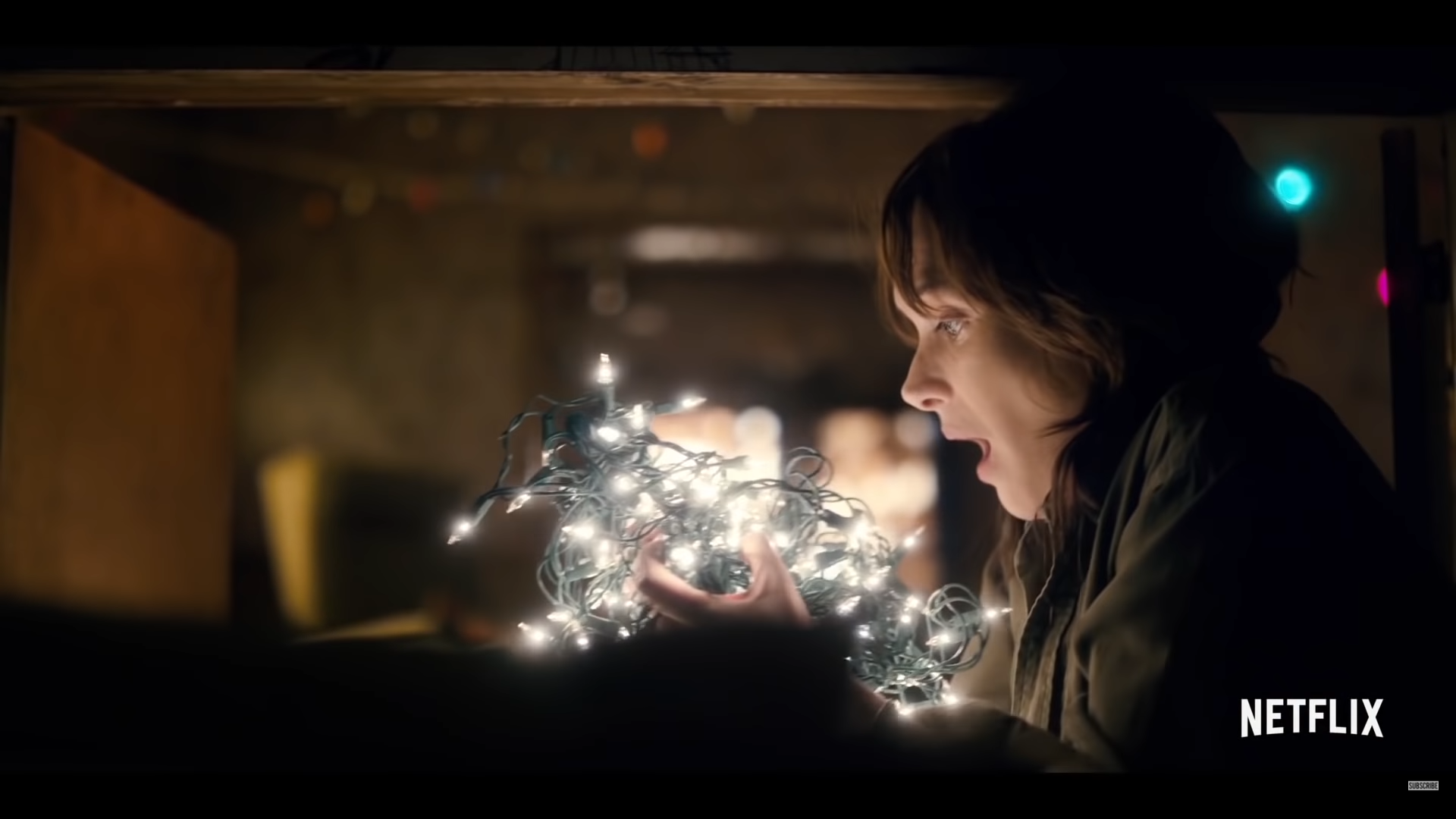
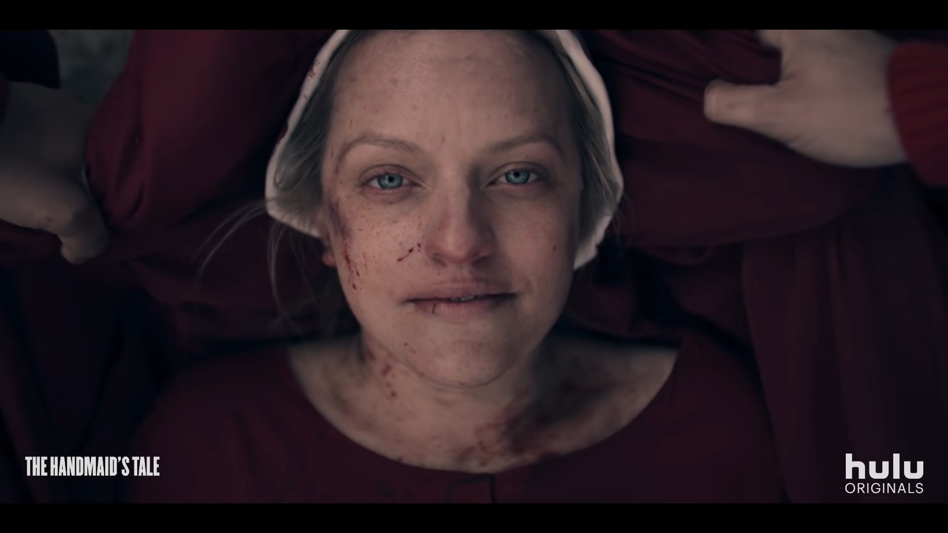
The above statement was true until online streaming service Netflix burst onto the scene with their own original shows, beginning their global domination with political drama House of Cards in 2013. It is fascinating to note that many of Netflix’s worldwide hit series including House of Cards, The Crown and Stranger Things (see below) have been shot in Storaro’s 2:1 Univisium instead of the traditional aspect ratio of 1.78. Interestingly, another subscription video service, Hulu, followed suit with their episodic production of the 1985 dystopian novel The Handmaid’s Tale in April 2017, which was met with both critical acclaim and viewer enthusiasm (Rotten Tomatoes, 2017). Univisium has even crept from online streaming only to television, as CBS produced their new series, Star Trek: Discovery in the 2:1 aspect ratio, airing the first episode in September 2017.
While it could be that compromise caused these wildly popular Netflix originals to turn to the 2:1 aspect ratio (as was the case with 2015’s Jurassic World, which was also shot in Univisium), it is also entirely possible that the creators of these shows sought to create a distinct and fresh frame for their images that would set their stories apart from the innumerable other series out there. The extra wideness of the 2:1 frame provides an epic experience that even a less visually literate viewer would consider “more cinematic” than your average TV production. On his website, award-winning cinematographer Neil Oseman also points out that Univisium is a format free of “baggage” — while 1.78 is considered “the TV ratio” and 2.39 is “the big movie ratio”, 2:1 is currently unassociated with any major genre of production, making it ripe for the picking. Finally, many viewers stream programs from service providers like Netflix using their smartphones, which are being manufactured with consistently larger aspect ratios, such as the Samsung Galaxy S8 and the LG G6, which both have aspect ratios of 18:9. It is possible that Netflix predicted the move to smartphones with wider aspect ratios and consequently decided to produce some of their content in Storaro’s progressive format to better suit the screens upon which their images would ultimately be viewed.
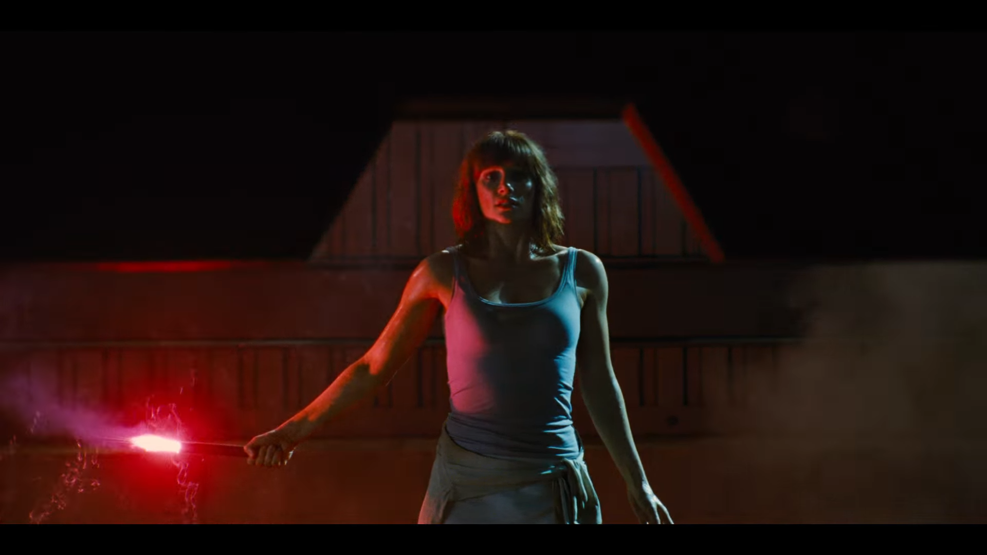
Whatever the reason for this choice in aspect ratio, it can be argued that the combination of Storaro’s Univisium with the high production quality, excellent writing and outstanding acting now synonymous with Netflix original shows is what caused these series to become popular in the first place. It is truly poetic in a circular kind of manner that, as with the introduction of the widescreen aspect ratios to cinema in the 1950s, this move towards a wider format in online streaming is ushering us into a new era for cinematic productions and viewing experiences.

16:9, YouTube and Wedding Filmmakers
It is worth mentioning an often overlooked and unappreciated genre of documentary video when discussing aspect ratios, and that is wedding filmmaking. While some wedding videographers prefer to upload their content to alternative platforms such as Vimeo, most can be found on YouTube. As previously mentioned, YouTube, like widescreen television, has a standard desktop aspect ratio of 16:9, automatically adding letterboxes to uploaded content that does not fit this format to prevent cropping or distortion. Certain “cinematic” wedding videographers like Kraig Adams or White in Revery add letterboxes to their videos in post-production, cropping the original image at the top and bottom of the frame to have the appearance of a 1.85:1 or 2.35:1 film. However, there is a strong argument to be made for uploading wedding films in their original 16:9 (1.78) format, as seen in the work of other filmmakers like Forestry Films or Filmstrong.
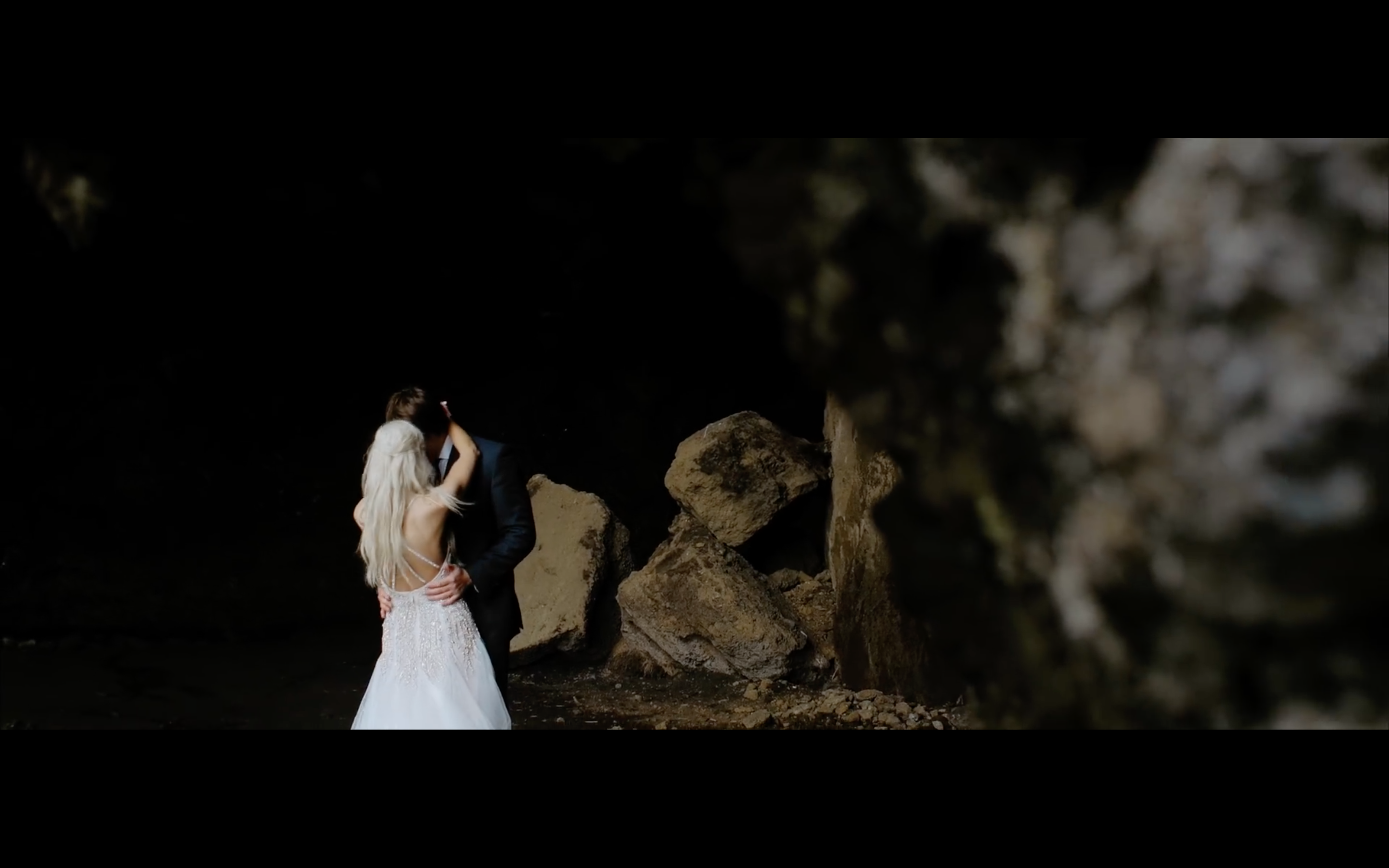
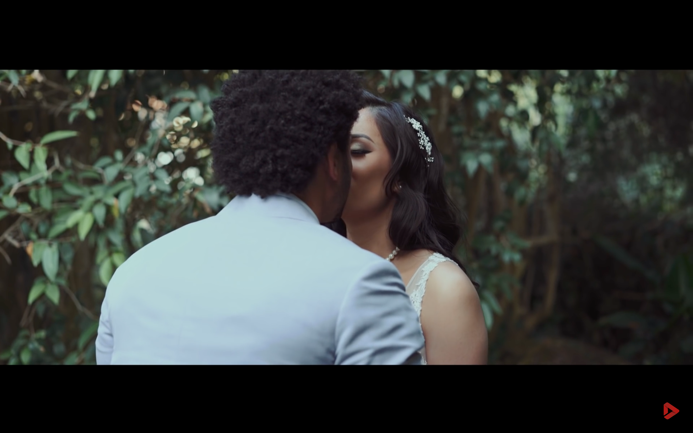
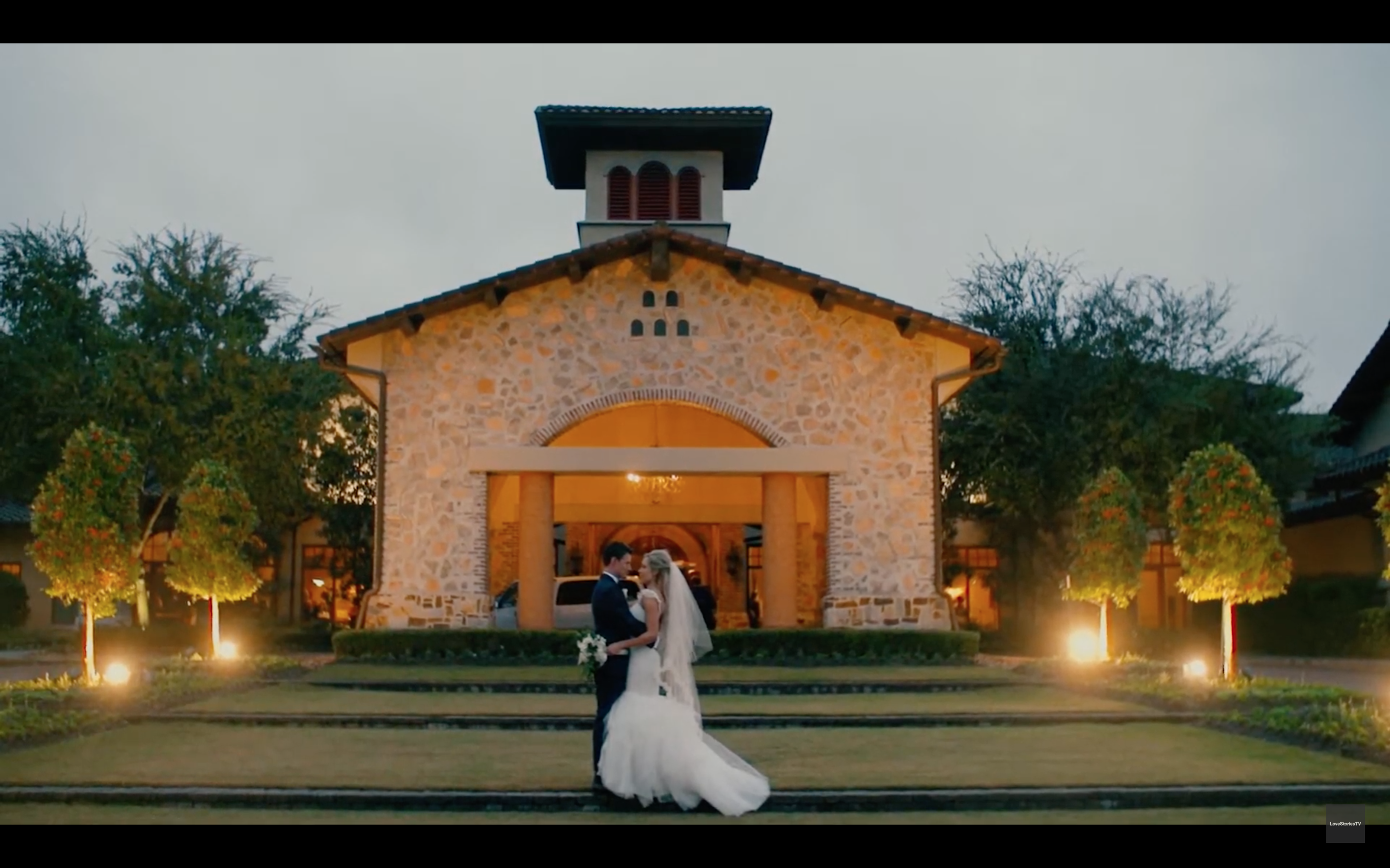
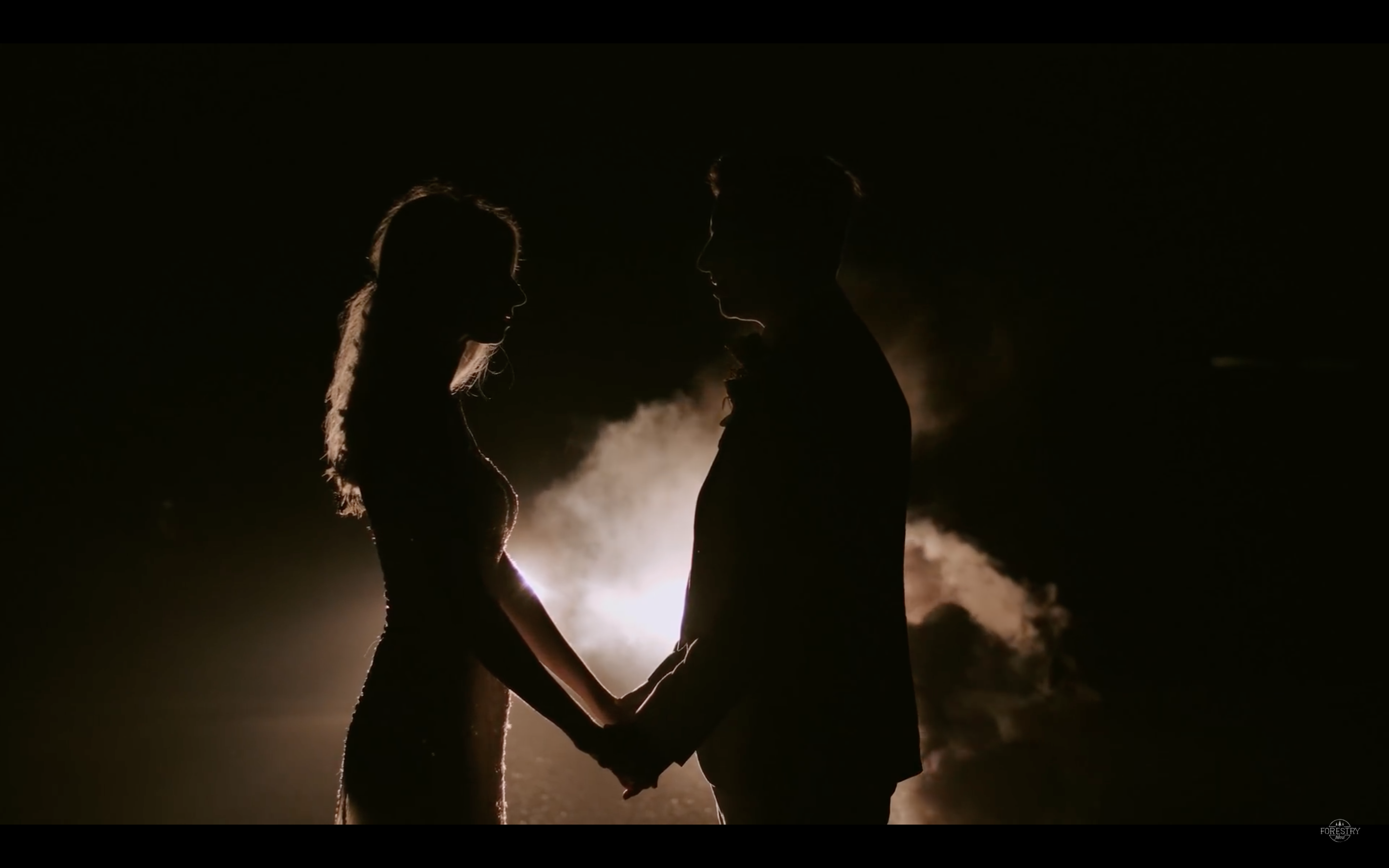
In essence, this comes down to a matter of size: both that of the image and that of the screen upon which the happy couple could be watching their film for the first time. To the untrained eye, an image with fat, black crop bars might be initially perceived as “more cinematic”, but in fact, it actually defeats the inherent purpose of a wedding film. Wedding videography aims to capture the couple’s special day, recording all the little moments they might forget in the whirlwind of their ceremony and reception, finally presenting it to them in the format that will provide complete and total immersion back into that happy event, almost as if they had time travelled back to that day. An example of a 1.78 wedding film letter-boxed to 2.35 can be seen below.
As most wedding videographers film in 1080p or 4k resolutions, 16:9 is the natural aspect ratio of this footage. Thus, unless the filmmaker takes consistent and meticulous care in composing their frames with eventually outputting their video with extreme letter-boxing in mind — which is often unlikely or impossible considering the frantic nature of weddings — all that letter-boxing in post achieves is cropping off portions of the image that are necessary to provide the couple with the immersive experience they expect from their wedding video. Adding letterboxes merely produces a narrow and, in some cases, cramped image, not suited at all to the nature of the content.
Finally, wedding videographers who crop their films with letterboxes possibly do not take into account the event that their clients may see their wedding video for the first time on a screen other than a widescreen HD television or desktop computer with a large monitor. Couples may experience the first viewing of their wedding film on a smartphone. While there is a gradual move to smartphones of wider aspect ratios as discussed in the previous section, the vast majority of smartphones today still have a 16:9 aspect ratio. Watching a letter-boxed wedding video on a 16:9 smartphone feels compressed and uncomfortably slim. It is surely the preferable option to simply stick to the native aspect ratio of 1.78 than to risk creating a displeasing image by artificially adding crop bars in post.
We hope you enjoyed this case study on the fascinating history and application of aspect ratios. If you would like to learn more about film history and how it impacts the videos you create, check out our video on the remarkable history of frame rates in cinema, and our video on the creative possibilities available to you when manipulating shutter speed in videos.

