As stated in our blog post on aspect ratios, both the size and composition of the cinematic frame impact the effectiveness and power of the video contained therein. In the past, viewers consumed moving pictures in a cinema or on a 4:3 television screen, today there are more than 2.1 billion individuals worldwide using smartphones to watch video content on online streaming platforms like Netflix and YouTube who are once again revolutionising the way people view video. In today’s blog post, we are diving into the 2D field that makes up the cinematic frame. We’ll mostly examine the practical manners in which a cinematic frame can be manipulated — whether it be to amplify its restrictions or make up for them — and how a cinematic frame can be easily composed to control the eye of the viewer.
Manipulating the Frame
Exaggerating the Frame
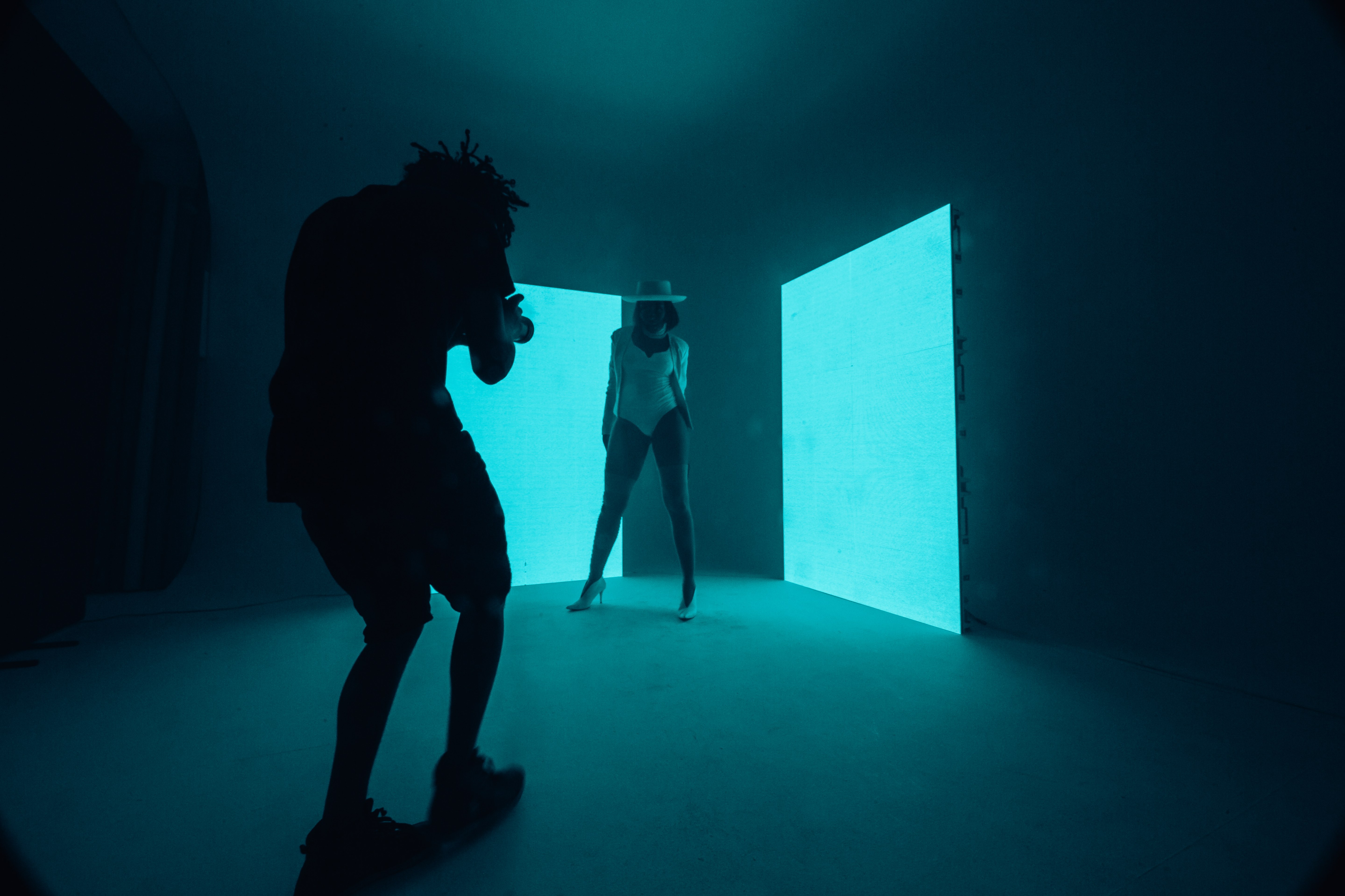
While in some cases one might wish to compensate for the limitations of the frame, there are instances where exaggerating the effect of the frame can be effective for the purposes of both style and storytelling. The simplest way to make a frame appear more box-like and structured is by creating smaller frames within the main frame of the video’s aspect ratio. This can be achieved either through the use of split screens or through positioning the camera in a manner where the subject is “naturally” framed by objects in the scene.
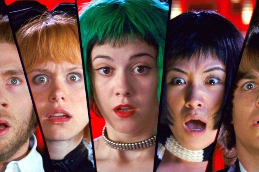
In the case of the music video for Charlie Puth’s single, “We Don’t Talk Anymore”, splitting the screen is an effective visual storytelling device as it allows the viewer to simultaneously witness both sides of a post-breakup situation without having to cut the entire frame between the two characters featured in the video. Split screens can also be used for purely stylistic purposes, such as in Edgar Wright’s Scott Pilgrim vs. the World where the several uses of various split-screen formats are intended to carry the graphic novel aesthetic of the print version of the story over to the screen.


Those who viewed the second and latest season of Marvel-Netflix’s Jessica Jones may have noticed how the camera uses “interesting angles” almost constantly, even when filming apparently mundane scenes such as dialogue. The titular character and others are often framed between items of furniture, collections of objects scattered on desk surfaces and through doors ajar and windows.
A similar observation was made by Evan Puschak of successful video essay YouTube channel, The Nerdwriter, when he viewed Wong Kar-Wai’s In the Mood for Love for the first time: “5 minutes in and every shot is a frame within a frame”, he wrote. In his video essay on the composition of the film, Puschak theorises that the perpetual framing of the two main characters through “smaller internal shapes” in the movie reflects how they are under constant surveillance from their neighbours and their community; the “double framing” also enhances the audience’s status as observers too. The use of frames within frames in Jessica Jones has a similar effect: not only does the double framing reflect Jessica’s profession as a private investigator who spies on people for a living, but it also makes visual the pressure she feels as a controversial powered individual being constantly watched and judged by those around her. Much of the show is shot giving the viewer the perspective of someone peaking into her life. Of course, the practical reasons for using frames within frames (e.g. drawing attention to a character) could be mentioned, but the impact these choices have on the mood and emotion of a scene as discussed above are perhaps far more interesting.
Compensating for the Frame
When one thinks of how a filmmaker might compensate for the limitations of the rectangular cinematic frame, the first method that comes to mind is probably camera movement. At its most basic and practical, camera movement is designed to make up for the fact that the viewer cannot move their eyes or turn their head to obtain a greater view of what is going on around them — their point of view is restricted entirely to what is being shown on the screen. While some might point to the cold, clinical and calculated camera movements of master filmmaker David Fincher, it is worth discussing those produced by a director whose work is acknowledged far less among those who appreciate quality cinema: Michael Bay.
Bay is a controversial filmmaker who inspires a lot of rabid hate with his vacuous blockbuster movies, but the one thing he consistently achieves is making virtually every shot in his films swell in depth and extent. Tony Zhou of Every Frame a Painting studied the body of Bay’s work up to mid-2014 and made several insightful observations about how he constructs his images. Zhou explained that Bay is obsessed with making every shot dynamic — he almost exclusively uses the combination of a camera on a wide or telephoto lens positioned at a low angle and moving in a circular motion to shoot scenes packed with layers of depth and movement in varying directions, thus creating a “sense of epic scale”. There are many things that could be said about a Transformers flick, but one comment that has probably never been made is that their visuals feel small, cramped or confined to the rectangle of the screen. While Bay’s movies could be considered unsophisticated and distasteful, it is undeniable that if one seeks to expand the size of the frame without actually making it bigger, there is much that can be gleaned from his techniques.
Guiding the Eye of the Viewer
As cinema is a “language of images” (Vittorio Storaro, 2007) and images are created with the intent of being viewed, it is crucial that frames are composed in a manner that controls the viewer’s gaze and keeps it within the boundaries of the image before them. This final section will cover some simple principles that can be applied when composing a frame to direct and control the eye of the viewer. There are forces at play within the frame which influence how images are perceived by the viewer. Understanding the basics in this area of visual literacy can help one construct compositions that are either pleasing to the eye or effective in creating a certain mood. However, it must be made clear that none of these principles are hard and fast rules — they can (and, in many instances, should) be “broken” in order to rouse a certain feeling in the audience.
Firstly, one must pay attention to vertical and horizontal lines when composing an image: vertical lines are typically perceived as striking, forceful and vigorous, whereas horizontal lines can suggest calm and normalcy. Thus, if one seeks to create a sense of discomfort or unrest, tilting the horizon to an unnatural angle (e.g. a Dutch Tilt) can be an effective way to do this. For example, this technique is often used in the establishing shots in Jessica Jones, perhaps to reflect how Jessica is always intoxicated, or to suggest that things are not always as they appear.
Secondly, it is vital to remember that the frame’s rim is “magnetic”, i.e. if any object or subject is placed too close to the edge of the frame, the viewer will feel as if the object is sticking to the border or being pulled out of the frame altogether. Placing a subject in the centre of the frame is the safest and most stable composition, but it can also be extremely boring, which is why dialogue scenes in films are often framed as over the shoulder shots with the edit cutting between frames of each subject positioned to the left or right of the image. A determining factor in which character is placed on which side will be who is more important and/or powerful in the conversation. In creative circles, it is common knowledge that people pay more attention to what is on the right of the frame than the left, as the right has an inherent and inexplicable weight and pull to it that the left does not. Thus, it is effective to position more important subjects and objects to the right rather than the left so the audiences will immediately sense their significance.
Finally, there are some helpful methods one can use to divide the frame into sections, thus making it easier to compose a balanced image. An example is the Rule of Thirds, whereby an image is divided by two equally spaced horizontal lines and two equally spaced vertical lines to create nine rectangles within the frame. Placing objects along these lines or at the points where they intersect is a simple way to focus the viewer’s attention.
Vectors are also extremely useful in this regard. Vectors are simply lines onscreen, either physical or assumed. There are three main types: graphic vectors (stationary elements in the shot which suggest where the viewer’s eye should look, e.g. leading lines), index vectors (lines created by anything that points in a specific direction, commanding that the viewer looks in the same direction, e.g. the eye-line of a character on screen) and motion vectors (e.g. the line created when an object moves through a frame in a certain direction; the viewer assumes they will continue to follow that line). Vectors can be used to draw objects together, pull them apart or simply to maintain continuity in a shot.
Conclusion: The Cinematic Frame
The cinematic frame has a fascinating history, having expanded from the single option of the box-like 4:3 aspect ratio in the early 1900s to the many creative frame options available to filmmakers today. While previously unused aspect ratios are growing in popularity for online streaming television shows, longstanding ones such as 16:9 still have appropriate applications on platforms like YouTube. Within the structure of aspect ratio, there are ways to compensate for the limitations of the frame or to exaggerate its restrictions, whether this is through camera movement or composition. It will be thrilling to see how the frame for the medium of cinema, the scaffolding for this “simulacra of reality” (Vittorio Storaro, 2007) evolves in the years to come.
We hope you enjoyed this case study of the cinematic frame and how you can compensate for it and exaggerate it to guide the eye of your viewer. If you would like to learn more about film history and how it impacts the videos you create, check out our video on the remarkable history of frame rates in cinema, and our video on the creative possibilities available to you when manipulating shutter speed in videos.