In this quick video, Matti from Travel Feels shares why you should be using teal and orange as the base for your colour grading, and why it works so well. Let’s take a look…
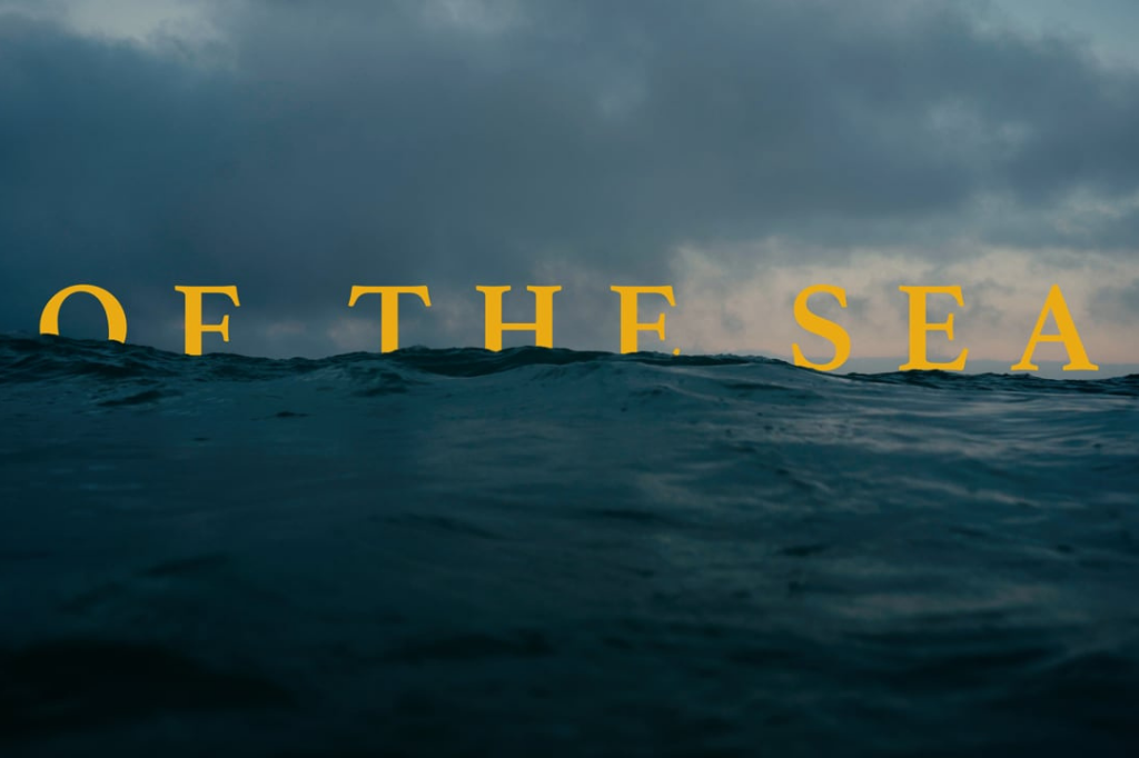
In this quick video, Matti Hoopoja at Travel Feels shares why you should be using the colours teal and orange as a base for your colour grading. Not because it looks cool or because it’s a trend, there’s reasoning behind it. If you were to look at a colour wheel, colours that are opposite on the wheel compliment each other. So let’s say you are colour grading for skin tones, you’ll be working with shades of orange and so teal would be the complimentary colour as it’s opposite orange on the colour wheel. Make sense? Here, we’ll let Matti explain…
Keep up with more from Travel Feels via their YouTube channel, be sure to click the subscribe button while you are there. You can also follow them on Twitter, Instagram or Facebook.
Other Cinematography posts you might enjoy:
Gear: Rode VideoMic Go vs Rode VideoMic Pro
DJI Spark Review: Filmed Entirely on the DJI Spark
7 Stupid Things You NEED to Have as a Filmmaker!
How to Use Shutter Speed, Aperture and ISO for Video
Inspiration: “Pulse” by Mike Olbinski


