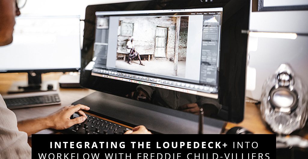
We asked Freddie some important questions about the Loupedeck+ to see how he has integrated it into his workflow and if it lives up to expectations.
Freelance Commercial Photographer Freddie Child-Villiers splits his time between Cape Town and London creating breath-taking photographic pieces. With such an understanding of the pressures that go into producing and delivering his work within tight deadlines, who better to review the Loupedeck+.
What interested you about the Loupedeck system initially?
Having been retouching commercially for over ten years, I’m always on the lookout for tools that can make my workflow more efficient. This tendency has generally led to me finding more tactile methods of interacting with my imagery. When using Adobe Photoshop, I rely heavily on a Wacom Cintiq with ExpressKey remote. I’ve set up this remote to handle tasks such as adding layers and adjustments, running actions and altering brush sizes, etc. While it is possible also to configure this remote for Adobe Lightroom, I’ve battled to get my head around its change in functionality between the two programs. And so began my interest in working with the Loupedeck.

Where/How did you first hear about it?
I first spotted the Loupedeck on Indiegogo back in 2016. It was a difficult product to miss, and I instantly thought that it was genius!

Do you have the original LD or the LD+?
I use Loupedeck+. Admittedly, I never ended up getting the ‘original’ Loupedeck, despite it being a fabulous idea. By the time it hit our shores, Adobe had implemented many new features into Lightroom, and the original Loupedeck had too few customisable controls to incorporate them. The Loupedeck+ solved this however and, to me, seemed like the more future-proof option.

How has your experience been using the LD+ and what software platforms do you use it on?
I thoroughly enjoy using Loupedeck+, and mainly use it with Adobe Lightroom, although I see that Loupedeck is supporting more and more programs, which I look forward to testing out in the future. In Lightroom, however, being able to make subtle adjustments by physically twisting the control knobs or fettling a colour slider has breathed new life into my interaction with the software. Not only has it sped up my process but, more importantly, it has made it more enjoyable!

Biggest positives about the system?
There are many:
For starters Loupdeck’s integration with Adobe Lightroom is seamless. Not once have I had a dial not work as expected, which may sound simple enough, but even the best products can be glitchy at times. When using the Loupedeck+, there’s no doubt that a lot of time has been spent developing a solid product, both in terms of hardware and software.
Then, from a design point of view; the layout of the Loupedeck+ is exceptionally logical. After about an hour, my fingers were dancing over the controls without me having to glance at the Loupedeck or the develop/adjustment panel. This made me hyper-aware of the adjustments that I was making and focus only on the photograph at hand.
I feel that I must also mention that while many, including myself, may initially regard the Loupedeck as an editing tool primarily, it is also highly effective at sorting photographs. Switching between ‘grid’ and ‘loupe’ views is done with a single button. Marking images either by colour or star rating is also done with dedicated buttons. So to can images be rotated and their adjustments copied and pasted, again, all with a single press. There was a slight learning curve at first, but once I broke my old habits, I can say without hesitation that I am much more efficient at sorting through photographs than I was before.

Any drawbacks or suggestions for improvements?
The only drawbacks of this generation are thankfully only software related, and hopefully fixable.
Most frustrating are the popups. Every time one opens Lightroom, you’ll be met with a popup saying “Loupdeck thinks you look great today”. This is just one of a couple of popups that display while using a Loupedeck and, when they do, Lightroom becomes almost unresponsive – until they eventually fade away.
Loupedeck support says that they’re working on including an option to turn off these messages, in a coming update. So, fingers crossed!
I’d also like the ability to change how responsive the HSL sliders are. While they’re currently very accurate, with each click representing a 1% movement in either direction, it can be rather time-consuming if you want to quickly get a feeling for how they might adjust a colours hue, saturation, etc. Again, Loupedeck say that they’re working on a fix for this in future updates.
Otherwise, I think that Loupedeck is a great addition to any photographer/ photo retoucher’s arsenal. It does exactly what it says on the tin and I recommend giving it a try!

Interested in having a closer look at the Loupedeck+? Head on over to Orms Direct to see the full specs and more details as to exactly how this editing console will streamline your workflow. Interested in purchasing your own Loupedeck+? Good to know that until 16 June 2019 you’ll save when purchasing yours from Orms!
Be sure to give Freddie Child-Villiers a follow on Instagram for more of his incredible work, or head over to his website for more.


